
.svg)
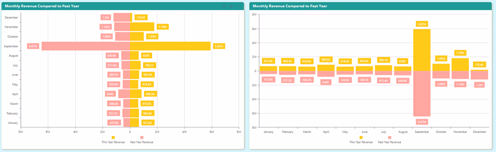
Bi-Directional Chart
Compare two formulas over a joint Axis while presenting them back to back for better visualization.
Bar charts and Column charts are fundamental and useful tools when it comes to data exploration.
By using a bar chart you can easily compare data between groups or- in the case of column charts- to show data changes over time. But what if you need to add an advanced ability such as comparing two values while keeping the simplicity of those visualizations?
Paldi’s “Bi-Directional Bar Chart” is your solution. Help Viewers visualize complex comparing data use cases while keeping beautiful UX/UI.

Key Features
- Toggle between bar chart and column chart.
- Get all Sisense native abilities for conditional formatting.
- User-friendly and intuitive design panel.
- Sisense native look and feel.
Bi-Directional widget

See this plugin in action
Get a personalized demo and discover how PALDI Solutions can transform your Sisense dashboards.
Book a free demo
Browse 70+ Certified Add-Ons
Go to Sisense Add-ons MarketplaceGo to Sisense Add-ons Marketplace
Enhance your Sisense Experience With our Top Rated Reporting Suite
Clients who use these with the Exports Enhancements
see faster adoption, richer insights, and greater ROI.
see faster adoption, richer insights, and greater ROI.


Flexi BloX
Build rich, custom layouts in Sisense dashboards with drag-and-drop control — no code needed
Best Seller
Advanced Table With Aggregation
Discover a vast array of powerful new capabilities to help elevate your tables to the next level!
Best Seller
Advanced Expandable Pivot Table
Get maximum analytics capabilities with Paldi’s Expandable Pivot plugin.
Best Seller

Leave the implementation to us.
"With the help of Paldi Plugins, you can just click and it’s there.
We were able to leverage Sisense to create a better user experience from a designer and user perspective."

HAMZA
/ Head of Data Analytics
5x
Faster Dashboard Interactions
60+
Predefined Dashboards Launched
90%
of Non-Technical Users Onboarded