
.svg)
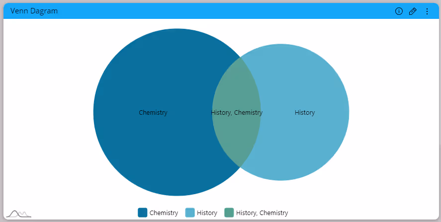
Adaptive Venn Diagram
Visualize data set relationships with Venn diagram, using overlapping circles to illustrate intersections and distinctions for insightful data analysis.
Paldi’s Venn Diagram plugin simplifies data visualization by showing connections between sets.
Using circles to represent unique categories makes it easy to grasp commonalities and distinctions.
This interactive tool enhances Sisense, allowing users to explore overlapping data sets for deeper insights.
Whether analyzing campaign audiences, employee involvement, or prioritizing product features, this plugin offers a visually captivating way to understand relationships in your data.
Key Features:
- Visually stunning chart with a clean and modern design.
- Widget elements customization, including slice colors, legend, labels, etc.
- User-friendly interface.
Venn Diagram Widget:


See this plugin in action
Get a personalized demo and discover how PALDI Solutions can transform your Sisense dashboards.
Book a free demo
Browse 70+ Certified Add-Ons
Go to Sisense Add-ons MarketplaceGo to Sisense Add-ons Marketplace
Enhance your Sisense Experience With our Top Rated Reporting Suite
Clients who use these with the Exports Enhancements
see faster adoption, richer insights, and greater ROI.
see faster adoption, richer insights, and greater ROI.
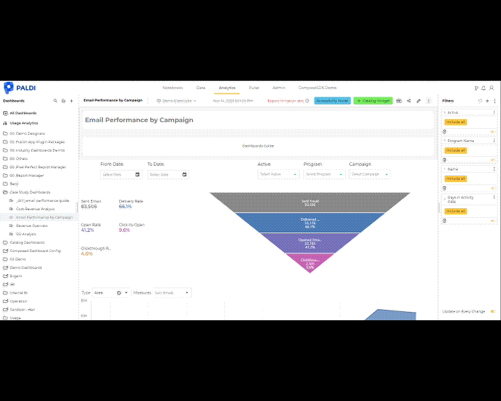


Flexi BloX
Build rich, custom layouts in Sisense dashboards with drag-and-drop control — no code needed
Best Seller
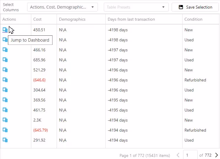
Advanced Table With Aggregation
Discover a vast array of powerful new capabilities to help elevate your tables to the next level!
Best Seller
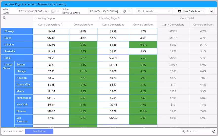
Advanced Expandable Pivot Table
Get maximum analytics capabilities with Paldi’s Expandable Pivot plugin.
Best Seller

Leave the implementation to us.
"With the help of Paldi Plugins, you can just click and it’s there.
We were able to leverage Sisense to create a better user experience from a designer and user perspective."

HAMZA
/ Head of Data Analytics
5x
Faster Dashboard Interactions
60+
Predefined Dashboards Launched
90%
of Non-Technical Users Onboarded