Let’s explore how Paldi’s add-ons can improve your Sisense dashboards.
Thank you! Your submission has been received!
Oops! Something went wrong while submitting the form.
What you’ll get in your 1:1 demo:
Custom walkthrough of your use case
Plugin recommendations
Live Q&A with a Sisense expert
How to add a button to the dashboard toolbar:
Follow the steps below to incorporate a button into the toolbar of a Sisense dashboard.
Open the dashboard to which you want to add a button to the toolbar.
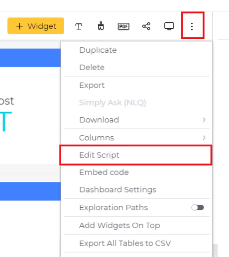
Access the dashboard menu by clicking on the three dots located at the top-right corner of the dashboard and choose 'Edit Script.' This action will open the script editor for the dashboard in a new tab.
Copy and paste the script provided below into the script editor window of the dashboard. Feel free to customize the button's style, text, and add the desired action to be performed upon clicking.
buttonText.textContent = 'New Button'; //Text to be displayed on button
newButton.append(buttonText);
$(newButton).on({
click: ({target}) => {
//Add action to be performed on button click
console.log('Button Clicked');
},
mouseenter: (event) => {
$(event.currentTarget).css('background-color', '#aeaddb'); //Background color on hover over
},
mouseleave: (event) => {
$(event.currentTarget).css('background-color', '#9b9ae6'); //Background color
}
});
btnsHolder.prepend(newButton);
})
Save the script, and refresh the dashboard to observe the newly added button in action.
read time
Add Clickable elements To Dashboard Headers
Published by
Benjamin Nissim
Product Manager / Solution Architect
February 24, 2024
Follow the steps below to incorporate a button into the toolbar of a Sisense dashboard.
How to add a button to the dashboard toolbar:
Follow the steps below to incorporate a button into the toolbar of a Sisense dashboard.
Open the dashboard to which you want to add a button to the toolbar.
Access the dashboard menu by clicking on the three dots located at the top-right corner of the dashboard and choose 'Edit Script.' This action will open the script editor for the dashboard in a new tab.
Copy and paste the script provided below into the script editor window of the dashboard. Feel free to customize the button's style, text, and add the desired action to be performed upon clicking.
A delivered report fails to be read in four distinct ways. Only one of them is about the file. The other three are a trigger problem, a scope problem and a lifecycle problem, and all three are invisible from the sending end.
A scheduled report is judged on whether it was sent.
The person receiving it judges it on whether they read it. Those are two different tests, and almost every reporting setup in existence measures the first one. The job ran. The mail server accepted it. Nothing went red. By every signal available to the person who built it, the report succeeded.
This piece is about the gap between those two tests. It is not an argument about file formats, and it is not a claim that PDFs are bad. It is that a delivered report fails to be read in four distinct ways, only one of which is about the file, and the other three are usually invisible to whoever set it up.
There are no statistics in this article. There is a large amount of published guesswork about how many business reports go unread, none of which survives being checked, and adding to it would not help you. What follows is mechanisms instead, most of them documented by Sisense, all of them checkable against your own setup this afternoon.
Failure one: it arrives as a door
An attachment is not information. It is a decision to open something.
That decision gets made on a phone, between two meetings, by somebody who wanted one number. The number is on the other side of the door, and the door costs a download, an app switch and a pinch zoom. So the report that took the most work to produce gets the least attention in the company, and the reason is not that nobody cares.
What makes this one interesting is that it is the failure everybody notices and the only one anybody tries to fix. The usual response is to make the attachment better. Better layout, better chart, cleaner cover page. All of which improves the thing behind the door without touching the door.
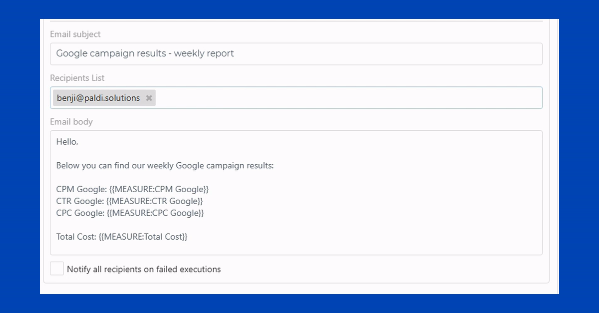
Sisense will put the dashboard in the message body rather than attach it, and that is worth knowing because it is free and already installed. When you share a dashboard, in Sisense's own words, "you can configure Sisense to send periodic email notifications containing the dashboard inside the email's body or as a PDF attachment to your dashboard's Shared Users."1
This is our own interface, and it is here because it is the clearest picture of what the alternative to an attachment looks like. Each figure in the message is written once as a token, and replaced with that job's own live value when it runs.
The interesting question is not how to make people open the attachment. It is whether the thing they actually wanted could have been in the sentence they already read.
The check: open your own scheduled report on a phone, as a recipient, not as its author. Count the taps to the number.
Failure two: it arrives on time and it is wrong
This is the expensive one, and it is almost impossible to see.
A report scheduled for seven in the morning is a bet that the overnight load finished before seven. Most weeks you win. The weeks you lose look exactly like the weeks you win, because the report went out on time, formatted correctly, containing the data that existed at the moment it ran. Nothing failed. The schedule did precisely what it was told.
Somebody acts on it. Then on Thursday a number does not reconcile, and an afternoon disappears working backwards to a Tuesday morning that looked completely normal.
The mechanism is that a clock does not know anything about your data. It knows the time. The question a reporting job is really asking is "has the thing I am reporting on finished arriving", and a schedule answers a different question that is usually correlated with it and occasionally is not.
That is why event triggers exist, and why it is worth checking whether your reporting layer has them. A job that starts when the load finishes, or when an alert fires, is asking the right question. A job that starts at seven is asking a proxy for it.
The check: find the gap between when your load usually finishes and when your report usually sends. If it is under an hour, you are running closer to the edge than you think.
Failure three: it arrives incomplete, and nobody notices
Two of these are documented by Sisense, and both are design decisions with reasons behind them rather than faults. They matter here because neither one announces itself. The report arrives. It looks like a report. It is missing things.
Custom JavaScript does not survive an export. Sisense's documentation states that any custom JavaScript in widget or dashboard scripts "will not appear in Excel or CSV exports", because "exports always use the raw data and built-in formatting only".2 So if somebody scripted a widget into the thing your users actually want to look at, what leaves the building is the underlying data rather than what was built. On screen it is right. In the file it is raw.
A dashboard exported to PDF gives you the first page of each pivot. In Sisense's words: "By default, when you export a dashboard to PDF, only the first page of each pivot widget is exported."3 Exporting the pivot widget on its own behaves differently. The reason is that rendering a full table on export is expensive, which is fair, and Sisense sells a premium add on that removes the limit.4
There is a hard number attached to the widget level export as well: "You can export your Pivot table or table widget of up to 1,000 rows to PDF. Larger and more complex tables may fail."5
None of that is hidden. All of it is published. The problem is that the person who set the schedule up read the dashboard, not the documentation, and the recipient has no way to know that page two existed.
The check: open your last exported report next to the dashboard it came from and compare the bottom of the table. This takes ninety seconds and it is the single most useful thing in this article.
Failure four: it arrives for somebody who left
Recipient lists are written once, at the moment somebody asks for a report, and then almost never revisited.
So the report goes on arriving, accurately, on schedule, at an address belonging to somebody who changed job eighteen months ago. Or at a distribution list that three people have quietly filtered into an archive folder. Or at a customer who churned three months ago and is still receiving Monday's figures, which is the version of this that becomes a conversation.
This is not a technology failure at all. It is a lifecycle failure, and it persists because nobody owns the question. The report has an author, a schedule and a recipient list, and no owner for whether any of that is still true.
The honest position on fixing it is that visibility is the achievable part. A view of every reporting job in the system, with its owner and its target, filtered by people who have left, will tell you what is still going out on behalf of whom. Acting on what you find is still somebody's afternoon. We do not automate the cleanup and neither, as far as we can tell, does anybody else.
The check: ask your team how many scheduled reports are running inside your product right now. Then go and count. The gap between the guess and the number is the finding.
What this adds up to
Three of those four are not format problems.
The clock is a trigger problem. The truncation is a scope problem. The departed recipient is a lifecycle problem. Not one of them is improved by a better looking PDF, and all three are invisible from the sending end, which is the only end most people ever look at.
That is why "our reports go out fine" is such a common sentence and such a weak one. It describes the half of the system you can see. The half you cannot see is whether the numbers were ready, whether all of them arrived, and whether anybody at the other end is still there.
Five questions worth asking about your own reporting
Open one of your scheduled reports on a phone, as a recipient. How many taps to the number somebody actually wanted?
What is the gap between your load finishing and your report sending? Would you notice if the load ran late?
Does your reporting layer have a trigger that is not a clock? If a job can start from an event, the stale report problem mostly disappears.
Open your last export next to its dashboard. Same rows at the bottom? Same formatting?
How many scheduled reports are running right now, and who owns each one? If nobody can answer without asking an engineer, that is the answer.
If those five come back clean, your reporting is in better shape than most and this article was not for you. If two or three of them made you want to go and look at something, that is the useful outcome, and it costs nothing to check.
Related reading
If you are still choosing how to deliver a report at all, the companion piece walks through the five ways to do reporting in Sisense and which one fits which requirement. Ravid's broader piece on BI reporting in Sisense covers formats, delivery methods and use cases.
Sources
Every claim about Sisense on this page is linked to Sisense's own documentation or marketplace.
Sisense reporting options: five ways to deliver a report, and how to tell which one is yours
Export by hand, built-in sharing, Report Manager, Compose SDK, or a specialist add-on. What each one actually does, quoted from Sisense's own documentation, and the sentence about when it is the wrong choice.
Somebody has asked you for a report your dashboard cannot send.
Maybe it has to arrive every Monday at seven. Maybe it has to go to a client who will never have a login. Maybe it has to land in a storage bucket instead of an inbox, because somebody wrote a policy about attachments. Whatever the specific version is, you have discovered that building the dashboard and delivering what is on it are two different problems, and you are now looking at four or five ways of solving the second one.
The hard part is not that the options are complicated. It is that everybody who has written about them sells one of them.
We sell one of them too. We build add-ons for Sisense and one of them does reporting, and it is the last option on this page. What follows is the five real options, what each is genuinely good at, and the sentence about when it is the wrong choice. For a lot of readers the right answer is option two or option three, and where that is true this page says so.
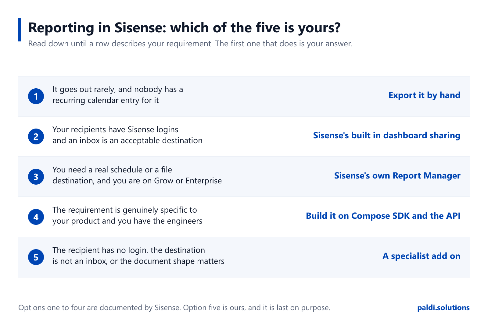
Read down until a row describes your requirement. The first one that does is your answer.
Option 1: Export it by hand
This goes first because it is what most people are actually doing, and a guide that pretends otherwise is not describing your company.
Somebody opens the dashboard, sets the filters, exports, renames the file and sends it. It works. It is free. It requires no procurement conversation, no security review and no ticket. For a report that is genuinely occasional, it is the correct answer and there is no cleverness that beats it.
It stops being the correct answer at the point where it becomes a recurring commitment. Not because it is inefficient, but because it is invisible. Manual reporting never appears on a roadmap, in a job description or in a capacity plan. It appears in the month the person doing it is on leave and three customers do not get their numbers.
When it is wrong: the moment somebody's calendar has a recurring entry for it.
Option 2: Sisense's built-in dashboard sharing
Sisense ships scheduled delivery in the base platform, and it is worth knowing exactly how far that goes, because this is the option people most often over-estimate and under-estimate in the same conversation.
What you get without buying anything else is email. In Sisense's own words, when you share a dashboard "you can configure Sisense to send periodic email notifications containing the dashboard inside the email's body or as a PDF attachment to your dashboard's Shared Users."1 That is a real capability, and for a great many reporting requirements it is the whole answer.
Two things it does not try to be. It is not delivery to a file destination, so if your requirement is a bucket or an SFTP server rather than an inbox, this is not the option that does it. And it goes to your dashboard's shared users, which means the recipient is somebody who exists in Sisense.
Sisense also has documented multitenancy of its own,2 and if you have been carrying an assumption that the platform cannot do that, drop it. A good part of what circulates as a reporting gap in this ecosystem is somebody describing a version of the product that predates the fix.
When it is right, and it often is: the recipients have logins, email is an acceptable destination, and what you need is the dashboard rather than a shaped document. Nothing further down this page is better than free and already installed.
When it is wrong: when the destination is not an inbox, when the recipient is not a Sisense user, when you need the shape of what gets delivered rather than the delivery itself, or when the trigger is not a time.
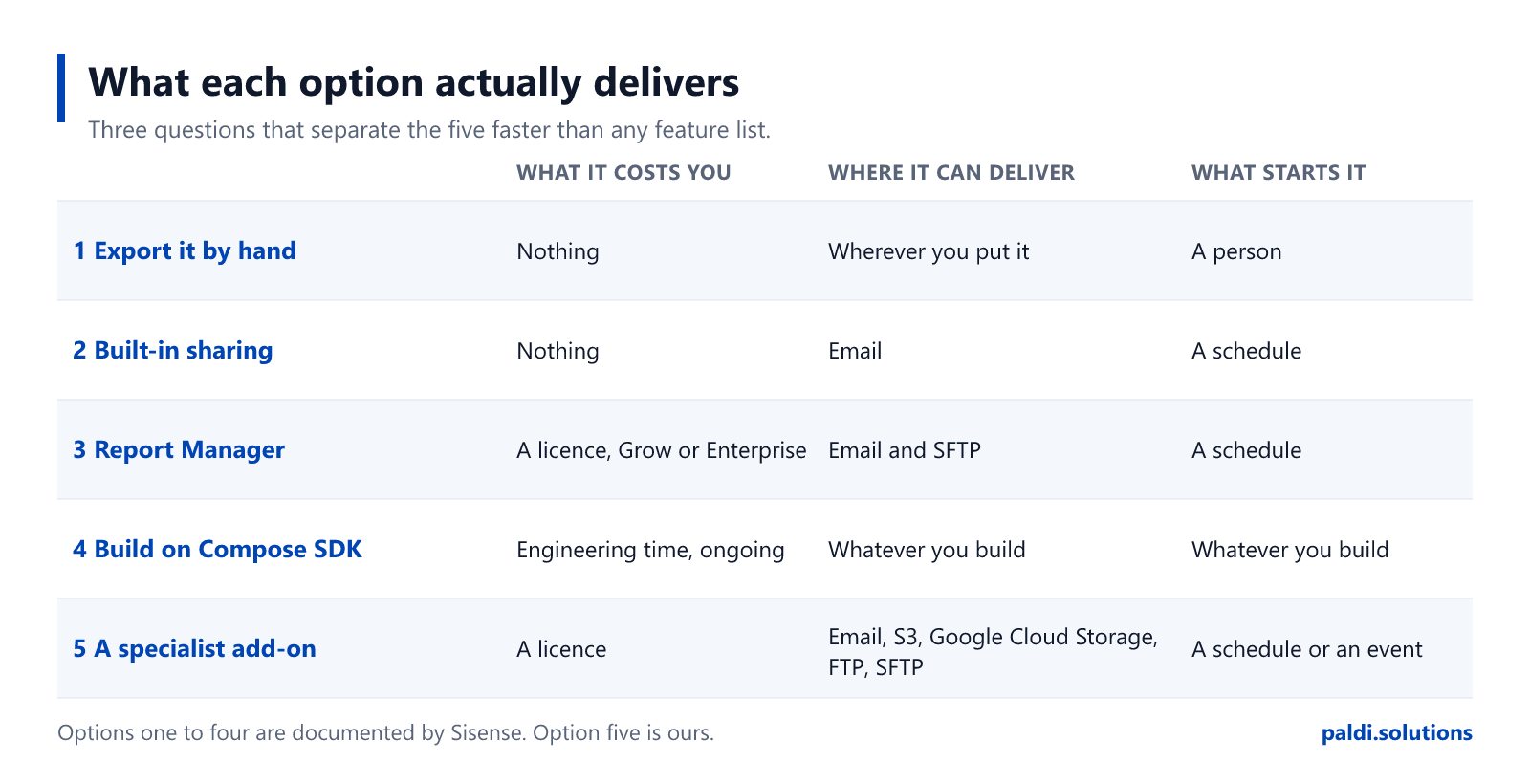
Three questions separate the five faster than any feature list. Options one to four are documented by Sisense; option five is ours.
Option 3: Sisense's own Report Manager
Sisense sells a reporting product of its own, and if the built-in sharing stops short of what you were asked for, this is the next thing to look at rather than the last.
Be clear about what it costs you. It is "a Sisense certified add-on", which means it "comes installed together with Sisense and you do not need to perform any separate download or installation. However, it is a premium add-on and is only available if you have purchased a license."3 It sits on the Grow and Enterprise tiers.3 So the question is not whether to install it. It is whether you are on a tier that includes it, or close enough that the upgrade is a live conversation.
What it adds over option two is the part worth knowing. Advanced schedules, because "Sisense Admins can set up advanced schedules including custom end dates, as well as hourly, weekly, and monthly reporting options".3 And a file destination, because when SFTP is enabled "reports are archived via SFTP to a server designated on a per report basis".3 That is the capability option two does not have, and it is usually what triggers this whole search.
It also runs per tenant. "Report Manager is available to all organization tenants, so each tenant can schedule and send reports independently, without relying on the system tenant for configuration",4 and it is not admin-only: "the Report Manager allows users with Viewer (consumer) roles to access the Report Manager and schedule reports for themselves and other users."4 If you are an embedded product team who assumed self-service scheduling was something you would have to build, check this first.
And it is actively developed, which a lot of comparison writing in this ecosystem quietly assumes is not the case. In release 2026.1.1, "in multitenant systems, all tenants can now schedule reports using Report Manager".5 In 2026.1.2 its APIs "have been certified and standardized to meet REST API standards and facilitate custom UI development", and two scheduling behaviours were fixed: reports that continued for one day past a configured end date, and reports that ignored dashboard and widget filters set at different date granularities.6 If you evaluated it before those landed, you evaluated a different product.
If you are on the tier, start here. Buying more of the platform you already run is the lowest friction thing on this page after option two, and platform-native features do not have to be re-integrated after an upgrade. If you already own it and are still reading, the five questions at the foot of this page are the fastest way to find out whether your remaining requirement is a real gap or a setting you have not found yet.
When it is wrong: when the tier economics do not work for you, or when the requirement is specific enough that a general product does not reach it.
Three limits worth knowing before you choose, whichever option you pick
These are published by Sisense in its own documentation. They are not gotchas. They are design decisions with reasons behind them, and knowing them before you choose is worth more than any comparison table, because they decide which of the five options below will actually satisfy the request you were given.
Custom JavaScript does not survive an export. Sisense's documentation states that any custom JavaScript in widget or dashboard scripts "will not appear in Excel or CSV exports", because "exports always use the raw data and built-in formatting only".7 If you have scripted a widget into the thing your users actually want to see, what leaves the building is the underlying data.
A dashboard exported to PDF gives you the first page of each pivot. In Sisense's words: "By default, when you export a dashboard to PDF, only the first page of each pivot widget is exported."8 Exporting the pivot widget on its own behaves differently. The limit exists because rendering a full table on export is expensive, which is a fair reason, and Sisense sells a premium add-on that removes it.9
Some export behaviour is add-on territory rather than base platform. Sisense's own Export Modifications add-on, which is premium, "also enables exporting to Excel for table and table with aggregation widgets" alongside its styling features.10 Whatever you choose, check which side of that line your widgets sit on before you promise anybody a file.
None of these three make Sisense a weaker platform. Every mature reporting stack has an equivalent list, and the useful thing about this one is that it is published rather than discovered.
Option 4: Build it yourself on Compose SDK and the API
Compose SDK is where a lot of new Sisense work starts, so this is the option most likely to be mis-scoped. Here is the useful fact.
Widgets rendered in Compose SDK Mode "can be exported to Excel directly from the dashboard".11 That is what it includes. It does not include scheduling, it does not include email delivery, and it does not include PDF. None of that is a criticism of the SDK, which is a component library rather than a reporting product. It does mean that "we will just build reporting on the SDK" is a larger sentence than it sounds. A scheduler is not the hard part. The hard part is retries, credentials, per-tenant configuration, the interface somebody uses to set a job up, and the fact that you now own all of it forever.
If you have the engineering capacity and the requirement is genuinely specific to your product, this is a legitimate and sometimes the only answer. Go in knowing you have added a reporting product to your own roadmap, maintained by people whose job was supposed to be building something else.
There is a middle path here that gets missed, and it is the most useful thing on this page for a team that has already decided to build. Sisense certified the Report Manager APIs to REST standards specifically to "facilitate custom UI development".6 You can put your own interface, in your own product, on top of an engine somebody else maintains. You get the control you wanted over what your users see, and you do not inherit the scheduler, the retries and the credential handling. For most teams reaching for option four, that trade is better than the one they were about to make.
When it is wrong: when the honest reason for choosing it is that it looked like a week of work.
Option 5: A specialist add-on
This is us, and it is the shortest section on this page for the same reason it is the last one: if options one to four covered your requirement, you do not need it.
Specialist add-ons exist for the gap between what a platform delivers and what a particular product needs. In reporting, four things tend to justify one.
Live values inside the message. Measure and dimension values printed into the subject line, the body and the file name, resolved against the job's own filters at the moment it runs, so the person who only needed one number never opens anything.
A trigger that is not a clock. A job that starts from an inbound call or an alert rather than a schedule, so the report follows the data load instead of guessing when it finished.
A file destination with no size ceiling on that route. Amazon S3, Google Cloud Storage, FTP and SFTP, with a link in the email instead of an attachment, and several CSVs arriving as one zip.
Documents that survive the export. A pivot or table that comes out whole rather than stopping where the first page stopped. A table with its own typography for the page, set separately from the one on screen. A layout whose width is chosen by paper size rather than by pixels. These are capabilities of the Expandable Pivot and Advanced Table widgets rather than of the reporting engine, and that distinction is worth holding onto when anybody sells you a bundle.
For teams building on top of it rather than using it, it deploys inside your own estate and carries a secured API for administrative operations, with the same interface available as a composed React component inside a Compose SDK application. The detail is on the Report Manager page.
What we are building now, because it may change which option is yours: delivery into Slack and into an API call carrying the payload, so a downstream system can act on a report rather than a person reading it; conversational control through MCP, so changing a reporting job is something you ask your own AI assistant to do; and a reporting job defined once and run repeatedly across different recipient lists and filter selections. That last one does not exist yet, and the thing that does exist today is break-by, which produces one document per value of a dimension and delivers the set together. Those are different, and the difference matters if it is what you were asked for.
We have worked on Sisense and nothing else for ten years, across more than 150 Sisense customers, as a Gold Certified partner, and it runs in production inside multiple enterprise organisations today.
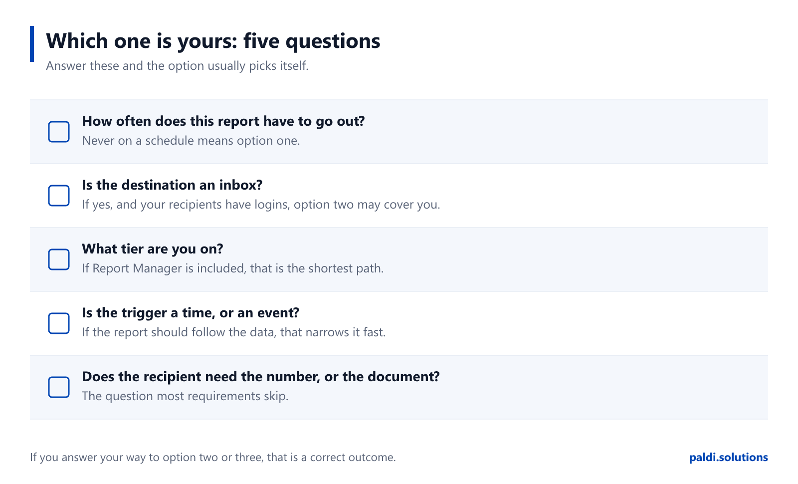
Which one is yours
Answer these five and the option usually picks itself.
How often does this report have to go out? Never on a schedule means option one, and stop reading.
Is the destination an inbox? If yes, and your recipients have Sisense logins, option two may already cover you and it costs nothing.
What tier are you on? If Report Manager is included, or the upgrade is already on the table, option three is the shortest path to a file destination and a real schedule.
Is the trigger a time, or an event? If a clock is genuinely the right trigger, most options work. If the report should follow the data, that narrows it fast.
Does the recipient need the number, or the document? This is the question that decides between delivery and presentation, and it is the one most requirements skip.
Worth screenshotting before your next reporting conversation.
If you answered your way to option two or option three, that is a correct outcome for this page, and we would rather you got there here than three months into an evaluation.
Related reading
Ravid's broader piece on BI reporting in Sisense covers formats, delivery methods and use cases. If you have already chosen and want the mechanics, the step-by-step scheduling guide walks through setting a job up, and this walkthrough shows how customers configured theirs.
Sources
Every claim about Sisense on this page is linked to Sisense's own documentation or marketplace.


.svg)