
.svg)
Actionable Insights from the Sisense Experts

Understanding the Role of Filters in Sisense

In the realm of data analysis and visualization, the power of filters cannot be overstated. Filters allow users to refine their data, focus on specific subsets, and extract valuable insights. Sisense, as a leading business intelligence platform, offers a robust set of filtering capabilities that empower users to tailor their analyses to their precise needs. In this guide, we will delve into the world of Sisense filters, exploring their functionality, customization options, and best practices. Additionally, we'll highlight how Paldi filter plugins can enhance the filtering experience within Sisense.
Understanding Star Schema and Dimensional Modeling
Filters play a pivotal role in Sisense dashboards, serving as indispensable tools for refining and analyzing data with precision and efficiency. By allowing users to focus on specific subsets of data, filters empower them to extract actionable insights and make informed decisions. Within the context of Sisense's architecture, the importance of filters is amplified, especially in conjunction with the star schema data model.
In the star schema, dimensions are segregated into their own tables, facilitating optimized data management and query processing. This structural approach streamlines data retrieval and analysis by separating descriptive attributes (dimensions) from measurable quantities (facts), thus enhancing the clarity and efficiency of data modeling. When filters are applied within Sisense dashboards, the system dynamically establishes joins between the fact table and the relevant dimension tables. This process enriches the data with contextual information, enabling users to delve deeper into their analyses while maintaining data integrity.
Behind the scenes, Sisense leverages these joins to incorporate a 'where' clause in the SQL queries generated for each widget, ensuring that the data displayed is filtered based on the user's selections. This seamless integration of filters into the querying process not only enhances the relevance and accuracy of insights presented but also optimizes query execution times, bolstering overall dashboard performance.
Furthermore, in scenarios where multiple fact tables are present, the star schema proves invaluable. Both fact tables connect to dimension tables, ensuring that when a filter is applied to a dimension, data from all relevant fact tables is filtered accordingly. This capability enables users to conduct comprehensive analyses across disparate data sources, fostering a holistic understanding of their data landscape.
Safeguarding Data Privacy in Sisense Dashboards
In the dynamic landscape of data security within business intelligence, a critical consideration revolves around presenting aggregated values to viewers while safeguarding granular data from unauthorized access. This balancing act is particularly crucial in scenarios where sensitive information, such as individual employee salaries, must be protected due to privacy and security regulations. For instance, while it's acceptable to display aggregated salary metrics like average departmental salaries or total monthly payroll, revealing individual salary details poses a significant risk. However, the introduction of filters within dashboards can potentially breach this security by allowing viewers to infer granular information. Consider a scenario within the IT department, where most employees are above 30 years old except for one individual aged below 25. If a dashboard features filters based on department and age group, viewers could easily discern details about the younger employee by filtering for "department=IT" and "age group=20-30." This unintended revelation of sensitive data underscores the importance of vigilance when selecting filter fields and crafting dashboards.
To address this challenge, organizations must exercise caution when selecting filter fields and constructing dashboards within Sisense. By carefully evaluating the potential implications of filter usage and considering the sensitivity of the underlying data, organizations can mitigate the risk of unintentional data exposure and maintain compliance with regulatory standards. Also there is a powerful plugin available, called Avoid Over Filtering offered by Paldi Solutions, aimed at enhancing data security within Sisense dashboards.
Elevating Filter Styling
Consistency in filter styling holds significant importance within Sisense as it directly impacts the overall user experience and perception of the dashboard. Filters serve as essential navigational tools, allowing users to interact with and explore data sets effectively. When filters seamlessly integrate with the dashboard's design language, users can navigate through data more intuitively, leading to improved comprehension and analysis. Moreover, visually cohesive filters contribute to a polished and professional dashboard aesthetic, reinforcing the credibility of the data presented and instilling confidence in users. In scenarios such as OEM deployments, where brand consistency is paramount, aligning filter styles with the overall dashboard design becomes even more critical, as it ensures that the user experience remains consistent across various platforms and deployments.
In Sisense, achieving consistent filter styling involves leveraging the platform's built-in customization features alongside additional plugins for enhanced flexibility. Sisense provides native options to adjust filter colors, allowing users to match filter aesthetics with other dashboard elements. However, for more advanced customization and styling capabilities, users can opt for plugins such as those offered by Paldi Solutions. Paldi's filter plugins offer extensive customization options, enabling users to tailor filter aesthetics with precision.
Enhancing User Experience with Advanced Filter Features
User experience with filters is paramount, as it can greatly enhance the efficiency and depth of data analysis. Providing additional features around filters can offer users valuable tools to navigate and analyze data more effectively. Here are some of the features that can be considered while working with filters.
1. Reset Filters
Resetting filters to their default state after applying multiple selections is a valuable feature that enhances user experience in data analysis. This functionality allows users to easily revert back to the original filter settings, providing a convenient way to start anew with their analysis. Thankfully, Sisense includes a built-in option to reset filters, ensuring users can effortlessly return to the default filter configuration whenever necessary.
2. Filter Bookmark
Filter bookmarking, or the ability to save current filter selections for future use, greatly improves user productivity and efficiency in data analysis workflows. With this feature, users can quickly apply previously saved filter configurations, streamlining the analysis process and eliminating the need to manually recreate complex filter setups. Paldi's Filter Bookmark plugin is a valuable addition to Sisense, offering users an intuitive tool for saving and recalling filter settings with ease, thereby enhancing the overall user experience within the platform.
3. Easy Filter Field Discovery
Facilitating easy discovery of specific filter fields within a dashboard is essential for improving usability, especially in scenarios where numerous filters are present. Without such functionality, users may struggle to locate specific filters, leading to frustration and inefficiency. While Sisense lacks a built-in option for this feature, external plugins such as Paldi's Filter Catalog can fill this gap.
Harnessing the Power of Sisense Filters
Sisense caters to diverse data types, seamlessly accommodating various filtering requirements.
Text Field Filters
For text dimension columns, Sisense offers a diverse range of filtering options, allowing users to include or exclude specific items, filter based on text containment or starting patterns, and more, ensuring granular control over data selection. However, for those seeking heightened customization and flexibility, Paldi's Advanced Filters plugin emerges as a compelling alternative, providing extensive options to tailor the look and feel of filter widgets.
Date Field Filters
In Sisense, date dimensions empower users to filter data across various granularities, from day to year, facilitating comprehensive temporal analysis. With functionalities like date range selection and predefined presets such as "last 3 years" or "last 12 months," users can efficiently narrow down temporal data to derive meaningful insights. However, for those seeking additional customization and ease of use, Paldi's Date Range filter plugin presents a compelling alternative.
Numeric Field Filters
Numeric dimensions afford users the flexibility to filter data based on numerical criteria, including greater than, less than, or equal to specific values. This capability, coupled with Paldi plugins, empowers users to refine their analyses with precision.
Levels of Filters in Sisense
Sisense offers three tiers of filtering granularity:
Dashboard Filters: Dashboard filters are applied at the dashboard level in Sisense, impacting all widgets within the dashboard. Users have the flexibility to modify these filters to suit their analytical needs. By adjusting these filters, viewers can refine the data displayed across multiple widgets, enabling comprehensive analysis tailored to specific criteria.
Widget Filters: Widget filters are applied within individual widgets, providing targeted data refinement within specific visualizations. When the same field is utilized in both dashboard and widget filters, only the widget filter takes precedence for that widget, overriding the dashboard filter. It's important to note that viewers do not have the ability to modify widget filters; only dashboard designers can make changes to these filters, ensuring consistency and control over data presentation within widgets.
Formula Filters: Formula filters are applied within analytical formulas and offer fine-grained control over data manipulation. When the same field is designated as a dashboard filter, widget filter, and formula filter, the formula filter takes precedence. This means that only the criteria specified in the formula filter will be applied, while the dashboard and widget filters will be disregarded. Similar to widget filters, formula filters can only be applied by dashboard designers, ensuring that complex data manipulations are executed with precision and accuracy.
Conclusion
Effective filtering is integral to extracting actionable insights from data within Sisense. By leveraging a combination of built-in filtering options and Paldi filter plugins, users can streamline analysis workflows, enhance usability, and unlock the full potential of their data. With the right filtering strategies in place, organizations can make informed decisions and drive business success.
.avif)
Sisense Dashboard Performance Optimization
Optimizing Sisense Dashboard Performance: A Comprehensive Guide
Sisense dashboards are designed to transform complex data into actionable insights. However, performance issues, such as slow loading times or timeout errors, can hinder their effectiveness. Identifying the root causes of these issues is crucial to ensure optimal performance. This guide provides a structured approach to troubleshooting and resolving common performance problems in Sisense.
Key Areas to Investigate
Performance issues often stem from one or more of the following areas:
- Data Model
- Dashboard Design
- Server Configuration and Network
- Environment Cleanup
Let’s explore each of these areas in detail and how you can address potential performance issues.
1. Data Model
Each widget on a Sisense dashboard generates a query to retrieve and display data. The speed of these queries can have a significant impact on dashboard performance. Slow queries often occur due to inefficient relationships or an excess of complex joins.
- Many-to-Many Joins: When two tables are joined with duplicate keys, the result is unnecessary duplication of records, which consumes excessive computing resources and leads to slower performance. It's essential to verify the cardinality of relationships and adjust them to One-to-Many or One-to-One where applicable. This ensures more efficient querying and reduces the load on the system. Learn more about troubleshooting many-to-many relationships.
Example of Many to Many: We have two tables: Products and Customers. Both tables contain a Category field:
Products Table:

Customers Table:

If we attempt to join the Products and Customers tables on the Category field, we create a Many-to-Many relationship. This occurs because:- Multiple products belong to the same category (e.g., Electronics has both Laptop and Smartphone).
- Multiple customers are associated with the same category (e.g., both Alice and Bob prefer Electronics).

- Excessive Joins: When large fact tables are joined with multiple dimension or lookup tables, the resulting queries can become very complex and resource-intensive. These complex queries require significant processing power to merge large datasets from different tables, which can lead to slower performance and longer load times, especially with large volumes of data. The more joins you have, the more SQL operations need to be executed, consuming more memory and resources, which impacts dashboard performance. To reduce the impact of excessive joins, one solution is to reorganize your data model into a more efficient structure.
A common approach is to use a flat table schema, where all the relevant data is denormalized into one single table. This eliminates the need for joins, improving query performance but increases the size of the database due to data redundancy. Alternatively, a star schema is often used, where a central fact table (e.g., Sales Transactions) is linked to multiple dimension tables (e.g., Products, Customers). This reduces the number of joins, making queries less complex and more efficient while maintaining a manageable database structure. Using a star schema, for example, allows the fact table to quickly reference the dimension tables, resulting in faster queries and better overall performance in dashboards. Check out these resources: Flat Table Schema, Star Schema.

- Data Types of Key Fields: Using numeric fields for joins instead of lengthy string fields can significantly improve query performance, especially when dealing with large datasets. Numeric fields are processed more efficiently because they require less memory and CPU to compare, as they are stored in a compact, fixed-size format. In contrast, string fields, especially long or variable-length strings, take up more memory and require additional processing to match during joins. This difference becomes especially noticeable when scaling dashboards or working with complex data models, as numeric joins can reduce query execution time and prevent performance bottlenecks. To optimize performance, consider using integers or other numeric data types as key fields in joins whenever possible.
- Relevance of Imported Data: The size of data directly affects query performance. Import only the relevant data required for analysis and avoid including unnecessary columns or historical data. In some cases, importing aggregated data instead of raw data can also reduce query time and storage requirements.
For instance, if you only need to analyze total sales by customer for the past month, importing raw data with every transaction or irrelevant details like shipping addresses can create unnecessary duplication. Instead, importing just the relevant columns or even pre-aggregated data, such as the total amount spent by each customer, can drastically improve query efficiency and reduce system load.
- Field Indexing: For live models, it is crucial to ensure that key fields are properly indexed. Field indexing significantly enhances query performance by reducing the time required to retrieve data. When fields are indexed, the system can quickly locate the necessary data, leading to faster query results and an overall improved dashboard experience.
- Using Views vs. Tables: When working with live models, it’s important to understand the performance impact of using views versus tables. A view is essentially a stored query that retrieves data from one or more tables, but every time a query is executed on a view, it triggers an additional query behind the scenes to fetch the data. This extra layer of query execution can significantly slow down performance, especially when dealing with large datasets or complex joins. Since views are essentially virtual tables, each time you query a view, the system needs to process the underlying query, which can increase query execution times and result in slower dashboard performance.
On the other hand, using tables provides direct access to data, which allows queries to be executed more efficiently. When you query a table, you're accessing the data directly without any intermediary steps, leading to faster query execution times. For optimal performance, it’s recommended to use tables whenever possible, as they minimize the additional overhead involved in querying. This approach is especially helpful in situations where speed is critical, such as when real-time or near-real-time data retrieval is necessary. By using tables, you can ensure that queries are processed more quickly, improving overall dashboard performance.
2. Dashboard Design
Even with an optimized data model, dashboard design plays a critical role in performance. Poor design can lead to slow query execution and long loading times.
- Complex Calculations: Complex calculations within widgets generate large, resource-intensive SQL queries. These queries are executed every time a filter is applied or the dashboard is refreshed, which increases loading times. To mitigate this, consider pre-calculating complex formulas in the data model rather than in the dashboard, so the system retrieves values directly from the table without having to execute complex queries each time.
Imagine a dashboard that tracks employee performance, and one of the metrics is the Employee Efficiency Ratio, calculated as:
(Total Tasks Completed / Total Hours Worked) * 100.
If this calculation is performed within the widget, the widget has to perform this calculation each time it refreshes, or when filters such as team or month are changed. This can slow down performance, especially when dealing with large datasets. A more efficient approach would be to pre-calculate the Employee Efficiency Ratio in the data model, creating a new column for it. This way, the dashboard can simply retrieve the pre-calculated value, improving load times and overall performance.
- Displaying Large Volumes of Non-Aggregated Data: Fetching large datasets without aggregation can severely slow down performance, especially when showing row-level data in pivot tables or charts. Sisense has to process and store the data on the web server before it can be displayed visually, which can significantly increase loading times. Aggregating data in the model before displaying it on the dashboard helps reduce the amount of data being processed. Additionally, consider using Sisense add-ons like Accordion and Jump-to Dashboard to allow users to access detailed data on demand without burdening the main dashboard. Accordion Add-on, Jump-to Dashboard Add-on.
- Number of Widgets: Having more widgets on a dashboard means more SQL queries are executed, leading to greater resource consumption and longer loading times. Sisense recommends limiting dashboards to 6-8 widgets for optimal performance. If you need more, consider using the Lazy Loading plugin, which ensures that only visible widgets execute queries, while non-visible widgets wait until they are scrolled into view. This reduces unnecessary resource usage and improves dashboard speed.
Lazy Loading Plugin.
For live models, using the Lazy Loading plugin will also help reduce cloud DWH costs by minimizing the number of queries sent to the database.
- Query Optimization: Sisense offers a Query Optimizer plugin that dynamically restructures queries, improving execution time and reducing load on the system. This is especially helpful when dealing with complex or large queries. Query Optimizer Plugin.
- Default Filters: Setting default filters is a simple but effective way to improve dashboard performance. By pre-setting filters to display only relevant data—such as showing only the current month’s data by default—you limit the amount of data loaded when the dashboard is first accessed. This reduces the processing time needed to display the data, ensuring that the dashboard loads faster and more efficiently.
Since each filter added to a dashboard and every user selection generates a new query to the database, it's important to use filters strategically. Exploring different filtering solutions can help optimize performance.
For example, if your dashboard contains data for multiple months, applying a default filter that limits the view to the current month ensures that only a smaller subset of data is queried and displayed. Not only does this improve the performance of the dashboard, but it also helps users focus on the most relevant and meaningful insights right away, without having to sift through large volumes of irrelevant information.
To support this, you can use the free Adaptive Default Filters plugin to set smart default filters based on user or date logic, and the free Hide Filters plugin to keep your dashboards clean while maintaining filter functionality in the background.
3. Server Configuration and Network
In addition to optimizing the data model and dashboard design, your server and network infrastructure also play a critical role in Sisense performance.
- System Requirements: Sisense has specific hardware and software requirements to ensure optimal performance. If your system doesn't meet these minimum requirements, performance may suffer. Refer to Sisense’s system requirements on Windows or Linux to ensure that your infrastructure is appropriately configured.
- Network for Live Models: If you are using a live model that queries data directly from the source, the speed of your network connection to the data source is crucial. A slow network can significantly delay query execution. To improve performance, ensure that the network connection to your data source is fast and stable.
- Database Performance: The efficiency of the database system, especially when using a live connection, directly affects query processing time. Ensure that the database is properly optimized and capable of handling large volumes of data and concurrent user requests. A slow or poorly configured database will lead to slower query execution, negatively impacting dashboard performance.
4. Environment Cleanup for Improved Performance
Regular maintenance of your Sisense environment is essential to sustain good performance. Over time, unnecessary data, dashboards, and users can accumulate, putting unnecessary strain on system resources.
Some best practices for maintaining a clean environment include:
- Remove Test Dashboards: Delete any test dashboards that are no longer needed.
- Delete Unused Elasticubes: Regularly remove old or unused Elasticubes to free up system resources.
- Remove Inactive Users: Ensure that only active users are listed in your Sisense environment.
- Turn Off Unused Plugins: Disable any plugins that are no longer in use to save resources.
- Disable Irrelevant Email Reports: Turn off any scheduled email reports that are no longer necessary.
By regularly cleaning up your environment, you can ensure optimal performance and avoid unnecessary resource consumption.
Conclusion
Optimizing Sisense dashboard performance requires attention to detail across multiple areas, including data model optimization, dashboard design, and server/network configuration. By following the best practices outlined above, you can significantly improve performance, ensuring that your dashboards load quickly and provide a seamless user experience.
Add Clickable elements To Dashboard Headers
How to add a button to the dashboard toolbar:
Follow the steps below to incorporate a button into the toolbar of a Sisense dashboard.
- Open the dashboard to which you want to add a button to the toolbar.
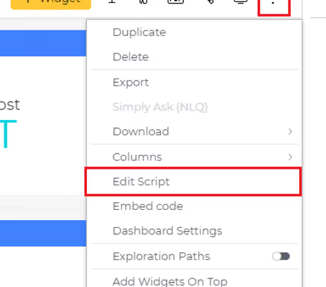
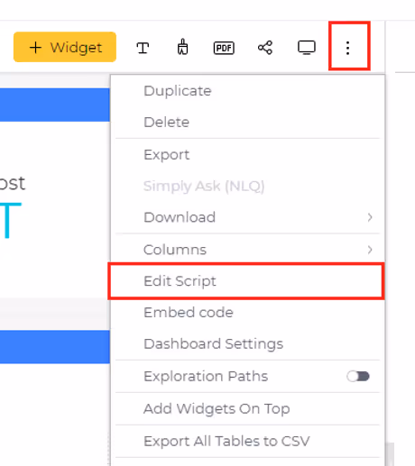
- Access the dashboard menu by clicking on the three dots located at the top-right corner of the dashboard and choose 'Edit Script.' This action will open the script editor for the dashboard in a new tab.
- Copy and paste the script provided below into the script editor window of the dashboard. Feel free to customize the button's style, text, and add the desired action to be performed upon clicking.
dashboard.on('initialized', (sender, args) => {
const btnsHolder = $('.prism-toolbar__section--right .prism-toolbar__cell.btns-holder');
const newButton = document.createElement('button');
newButton.className = 'btn custom-btn';
newButton.style.backgroundColor = '#9b9ae6'; //background color
newButton.style.color = '#000000'; //font color
const buttonText = document.createElement('span');
buttonText.className = 'btn__text btn-text-sp2';
buttonText.textContent = 'New Button'; //Text to be displayed on button
newButton.append(buttonText);
$(newButton).on({
click: ({target}) => {
//Add action to be performed on button click
console.log('Button Clicked');
},
mouseenter: (event) => {
$(event.currentTarget).css('background-color', '#aeaddb'); //Background color on hover over
},
mouseleave: (event) => {
$(event.currentTarget).css('background-color', '#9b9ae6'); //Background color
}
});
btnsHolder.prepend(newButton);
})
- Save the script, and refresh the dashboard to observe the newly added button in action.


Enhancing Web Security: A Deep Dive into Single Sign-On (SSO) and Web Access Tokens (WAT)
Single Sign-On (SSO) and Web Access Tokens (WAT) are two pivotal technologies in the domain of web security and user authentication. SSO simplifies the user experience by enabling access to multiple applications with a single set of login credentials, thereby enhancing both convenience and security. Conversely, WAT plays a crucial role in secure access management by granting temporary tokens that verify user identity and permissions across web applications. Both SSO and WAT are integral to creating a secure and seamless digital environment, each addressing unique facets of user authentication and access control. In the following sections, we will explore the mechanisms, benefits, and implementations of SSO and WAT.
Understanding Single Sign-On (SSO)
Single Sign-On (SSO) is a centralized authentication process that allows users to log in once and gain access to multiple applications without being prompted to log in again for each one. This technology is particularly beneficial in environments where users need to switch between different systems frequently. By reducing the number of login prompts, SSO not only enhances user convenience but also minimizes the risk of password fatigue and the associated security risks, such as password reuse or weak passwords. Moreover, SSO streamlines the management of user credentials, making it easier for administrators to enforce security policies and track access patterns.
How SSO Works
Single Sign-On (SSO) operates by establishing a trusted relationship between an identity provider (IdP) and multiple service providers (SPs). The IdP is responsible for authenticating the user's credentials, while the SPs are the various applications or services the user needs to access. This trusted relationship allows the user to authenticate once and gain access to multiple applications seamlessly.
Step-by-Step Process:
- Initial Authentication:
- When a user attempts to access an application (SP), they are redirected to the identity provider (IdP) if they are not already authenticated. The IdP presents a login page where the user enters their credentials (e.g., username and password).
- Credential Verification:
- The IdP verifies the user's credentials. If the credentials are correct, the IdP generates an authentication token or ticket. This token contains information about the user and is securely signed to prevent tampering.
- Token Exchange:
- The authentication token is sent back to the user's browser, which then forwards it to the original application (SP) the user tried to access. The application verifies the token's validity by checking the IdP's signature.
- Access Granted:
- Once the token is verified, the user is granted access to the application without needing to enter their credentials again. The token can be used for subsequent requests to other SPs, enabling seamless access to multiple applications.
- Single Logout:
- SSO systems often include a single logout feature, where logging out from the IdP also logs the user out from all connected applications. This ensures that the user's session is securely terminated across all services.
Underlying Technologies:
SSO relies on several protocols and technologies to function effectively. Some common protocols include:
- SAML (Security Assertion Markup Language): A widely used standard for exchanging authentication and authorization data between an IdP and SPs. SAML uses XML-based messages to communicate assertions about user authentication and access rights.
- OAuth: An open standard for token-based authentication and authorization, commonly used for granting third-party applications limited access to user resources without exposing passwords.
- OpenID Connect: An authentication layer built on top of OAuth 2.0, allowing clients to verify the identity of users based on the authentication performed by an IdP and to obtain basic profile information.
These protocols ensure secure and efficient communication between the IdP and SPs, enabling the seamless and secure exchange of authentication tokens.
Security Measures:
SSO systems implement several security measures to protect user credentials and authentication tokens:
- Encryption: Authentication tokens are encrypted to protect sensitive information during transmission.
- Digital Signatures: Tokens are digitally signed to prevent tampering and ensure their integrity.
- Multi-Factor Authentication (MFA): SSO can integrate MFA to add an extra layer of security, requiring users to provide additional verification (e.g., a code sent to their phone) beyond just a password.
- Session Management: SSO systems manage user sessions effectively, ensuring that tokens are valid only for a specific period and are renewed or revoked as needed.
By combining these security measures and protocols, SSO systems provide a robust framework for managing user authentication across multiple applications, enhancing both security and user convenience.
Pros and Cons of SSO
Usefule Materials:
Exploring Web Access Tokens (WAT)
Web Access Tokens (WAT) are digital credentials used to authenticate and authorize users across web applications. Unlike traditional session management mechanisms, WATs provide a more scalable and secure method of handling user sessions. Typically, these tokens are used in stateless authentication systems, where the server does not maintain any session information. Instead, all necessary user information is encoded within the token itself, which the client includes in each request to access protected resources.
How Web Access Tokens (WAT) Work
Web Access Tokens (WAT), commonly implemented as JSON Web Tokens (JWT), are digital credentials used to authenticate and authorize users across web applications. Unlike traditional session-based authentication, WATs provide a stateless mechanism, meaning the server does not need to maintain session information. Instead, all necessary user information is encoded within the token itself, which the client includes in each request to access protected resources.
Step-by-Step Process:
- User Authentication:
- When a user logs in to an application, they provide their credentials (e.g., username and password). The application sends these credentials to an authentication server for verification.
- Token Generation:
- Upon successful authentication, the authentication server generates a token, typically a JWT. This token contains encoded information about the user, such as their user ID, roles, and permissions. The token is digitally signed using a secret key or public/private key pair to ensure its integrity and authenticity.
- Token Storage:
- The generated token is sent back to the client (e.g., the user's browser or mobile app), where it is stored securely, often in local storage or a secure cookie. It's crucial to handle the token securely to prevent unauthorized access, such as through cross-site scripting (XSS) attacks.
- Token Usage:
- For subsequent requests to access protected resources, the client includes the token in the request header, typically in the Authorization header as a Bearer token. For example, the header might look like this: Authorization: Bearer <token>.
- Token Verification:
- When the server receives a request with a token, it verifies the token's signature to ensure it hasn't been tampered with. The server also checks the token's validity, including its expiration time and any other claims it contains. If the token is valid, the server processes the request and grants access to the requested resource.
- Token Expiration and Renewal:
- Tokens are usually issued with an expiration time to limit their validity period. Once a token expires, the user must re-authenticate to obtain a new token. Some systems use refresh tokens, which are long-lived tokens that can be used to obtain new access tokens without requiring the user to log in again.
Security Measures:
To ensure the security of WATs, several best practices are implemented:
- Encryption: Sensitive information within the token can be encrypted to protect user data.
- Signature Verification: Tokens are signed to ensure their integrity and authenticity. The server uses the same secret key (or public key in asymmetric encryption) to verify the token's signature.
- Secure Storage: Tokens should be stored securely on the client side, avoiding exposure to client-side scripts to prevent XSS attacks.
- Token Expiration: Tokens have an expiration time to limit the window of opportunity for misuse. Short-lived access tokens and long-lived refresh tokens balance security and user convenience.
- Scope and Audience Restrictions: Tokens can include claims that restrict their usage to specific scopes and audiences, enhancing security by ensuring tokens are used only as intended.
By following these practices, WATs provide a scalable and secure method of managing user authentication and authorization across web applications, improving both performance and user experience.
Pros and Cons of WAT
Usefule Materials:
Integrating SSO and WAT
Combining SSO and WAT can provide a comprehensive authentication and authorization solution. SSO can handle the initial authentication process, while WATs can manage user sessions and permissions across different applications. This integration allows organizations to leverage the strengths of both technologies, providing a seamless and secure user experience. In the next sections, we will explore real-world examples, best practices, and implementation strategies for integrating SSO and WAT in web applications.
- To further simplify the way you manage and implement Sisense, explore our Sisense Admin Plugins that streamline admin workflows and enhance customization.
- To get a better understanding of how Sisense operates behind the hood, take a look at our Understanding Sisense Events post.
Unleashing the Power of Advanced Visualizations: A Guide to Elevating Your Dashboards
Ever wondered why some charts work better than others in showing data? It's crucial to pick the right one, or your dashboard might confuse people instead of helping them. Sisense gives you lots of chart options, but knowing which to use can be tricky. Sometimes the built-in options might not cover all your needs. No worries! That's where this guide comes in. We'll show you some cool charts and explain when to use them. And if you find yourself needing more, we've got your back with our Paldi Solutions plugins.
We're excited to introduce Paldi's Advanced Visualization Kit, which contains a variety of interesting and useful visualizations that can elevate your dashboard to another level. Explore these advanced options to add depth and richness to your data representation, ensuring your Sisense dashboards are both visually compelling and highly informative.
Ready to dive in and make your data tell a story? Let's get started!
Exploring Advanced Visualizations: Innovative Types and Practical Applications
This part is all about checking out different ways to show your data. Think of it like finding the perfect picture for your numbers. Each type of chart is like a superhero with its own superpowers. We'll help you understand when to use them and how they make your dashboard more interesting. Whether it's simple pie charts or fancy drill treemaps, we've got all the cool stuff for you.
Sankey Diagram
The Sankey Diagram is a versatile and impactful data visualization tool designed to illustrate the flow of resources, energy, or information within a system. It uses cool interconnected pathways to draw out the flow and transformation of stuff. Imagine lines of different thickness showing how much of something is going where. It's like magic for understanding complex stuff! People in engineering, environmental science, and process optimization love using it because it helps find problems, and spots where things gather, and makes decisions smarter. It's basically a map that makes tricky things easy to understand!
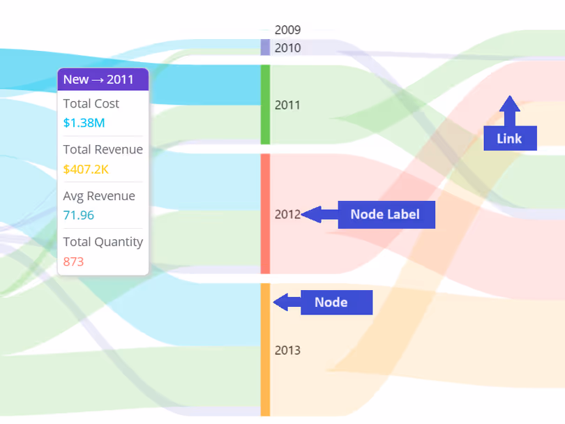
Multi-Node Sankey Diagram
A Multi-Node Sankey Diagram is an extension or variation of the traditional Sankey diagram, specifically designed to represent complex systems with multiple nodes or stages. In a standard Sankey diagram, you typically visualize the flow of resources, energy, or information from one source to one destination. However, in a Multi-Node Sankey Diagram, the complexity increases as it accommodates multiple intermediate nodes or stages in the flow.
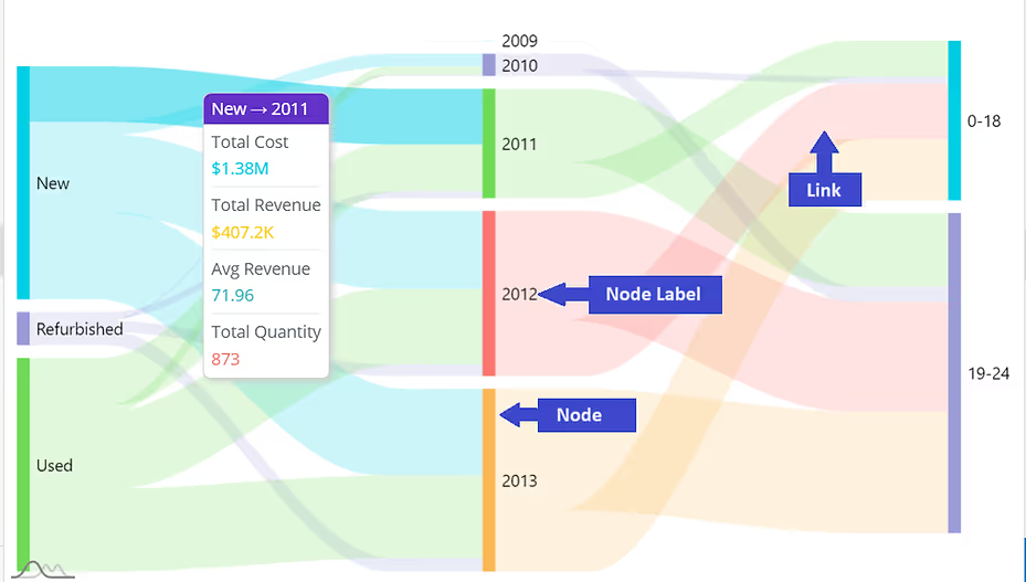
Imagine you're analyzing the user journey on an e-commerce website, and you want to understand the flow of visitors from landing on the homepage to completing a purchase. In this scenario, a Sankey diagram proves to be an invaluable tool. The diagram visually maps out the sequential steps users take, from the homepage through various pages such as product listings, cart, and finally, the checkout page. The width of the arrows in the Sankey diagram represents the volume of users at each stage, allowing you to pinpoint drop-off points and identify areas for optimization. It provides a clear and intuitive visualization of the user flow, making it easier to optimize the website's design and user experience for increased conversion rates.
Other Examples of Application
- Energy Flow Analysis - Visualize the flow of energy within a system.
- Material or Resource Flow - Visualizes the flow of materials or resources through various stages of production.
- Project Management - Illustrates the progression of tasks and resources in project management.
- Financial Budgeting and Expenditure - To represent budget allocations, expenses, and revenue streams.
Additionally, for users of Sisense, we at Paldi have an excellent plugin called Advanced Sankey Diagram. This plugin enhances the capabilities of Sisense by supporting multilevel Sankey Diagrams with a multitude of features, providing users with a robust tool for exploring and visualizing dependencies within their data.
Chord Dependency Diagram
The Chord Dependency Diagram is a visual representation that effectively displays relationships and connections between different entities or elements in a dataset. Its distinctive circular design features "chords" that connect related data points, making it easy to identify dependencies and correlations. This diagram is particularly useful for revealing intricate patterns and dependencies within complex datasets, providing a clear and intuitive way to grasp the interconnections between various components.
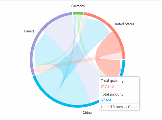
In the context of international trade between countries, a Chord Dependency Diagram proves to be an invaluable tool for visualizing and understanding the complex network of dependencies. Each node in the diagram represents a specific country, and the chords connecting them illustrate the trade relationships and dependencies between nations. The width of the chords reflects the volume or value of goods and services exchanged. This visualization allows policymakers, economists, and analysts to identify key trading partners, analyze the interdependencies between countries, and assess the potential impact of disruptions on the global supply chain.
Other Examples of Application
- Network Analysis - Visualizing and understanding complex relationships within network structures.
- Supply Chain Optimization - Visualizes dependencies and connections within a supply chain.
- Financial Transaction Networks - Represent relationships between different financial entities, such as banks, investment funds, or transactions.
- Logistics and Transportation - Showcase dependencies between different routes, modes of transportation, and supply chain components.
For Sisense users seeking to harness the full potential of this visualization, Paldi Solutions introduces an exceptional plugin: the Advanced Chord Dependency Diagram. This plugin simplifies the widget creation process, allowing users to seamlessly incorporate this powerful visualization into their Sisense dashboards.
Pie Chart
A Pie Chart is like a visual pizza, dividing information into slices to show the proportion of different categories in relation to the whole. It's perfect for quickly understanding the distribution of data.
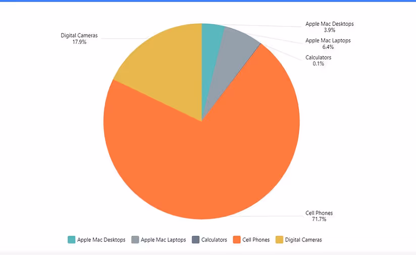
Imagine you're managing a marketing campaign with multiple channels contributing to overall success. In this scenario, a pie chart proves invaluable for illustrating the distribution of the campaign's budget across different channels. Each slice of the pie represents a specific channel, displaying the proportion of the total budget allocated to that particular avenue. This visual representation provides an instant and clear understanding of where the majority of resources are directed and allows for quick comparisons between channels. For instance, you can easily discern whether social media, email marketing, or other channels are receiving a larger or smaller share of the budget.
Pie-of-Pie Chart
The purpose of a Pie-of-Pie chart is to provide a more detailed breakdown of each slice that might be smaller or less significant in the overall dataset. It allows for a closer examination of particular elements within the larger context, making it easier to emphasize and understand details that might be overshadowed in the main chart. This type of chart is often used when there are one or more smaller data points that warrant attention or when a more granular view is needed for specific categories.
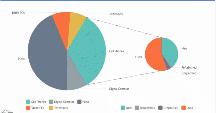
Consider a sales analysis scenario where you need to delve into the product categories contributing the most to overall revenue. A pie-of-pie chart becomes a valuable tool in this context. The main pie chart provides a high-level overview of total sales, with each slice representing a product category. However, to add granularity, the pie-of-pie chart is employed. The secondary pie chart breaks down the sales of the categories into subcategories. This visualization allows stakeholders to not only identify the dominant product category but also understand the composition of that category in terms of specific subcategories.
Other Examples of Application
- Market Share - Display the market share of various competitors within an industry.
- Revenue Distribution - Illustrate the proportion of revenue generated by different business units or product lines.
- Sales by Region - Break down sales figures for a particular region into smaller pies to identify the most lucrative sub-regions.
- Product Contribution - Highlight the specific products or services that contribute significantly to the revenue within a broader product category.
Paldi's Advanced Pie Chart serves as an excellent choice for Sisense dashboard developers, effortlessly allowing the creation of both standard pie charts and pie-of-pie charts. It offers extensive customization options, providing flexibility in tailoring the visual representation to specific preferences and requirements.
Treemaps
A Treemap is like a colorful puzzle, showing different categories as rectangles with sizes based on their values. It's great for understanding how things are divided up in a hierarchy. For instance, in a money tracker, it can display how your spending is split between different expense categories.
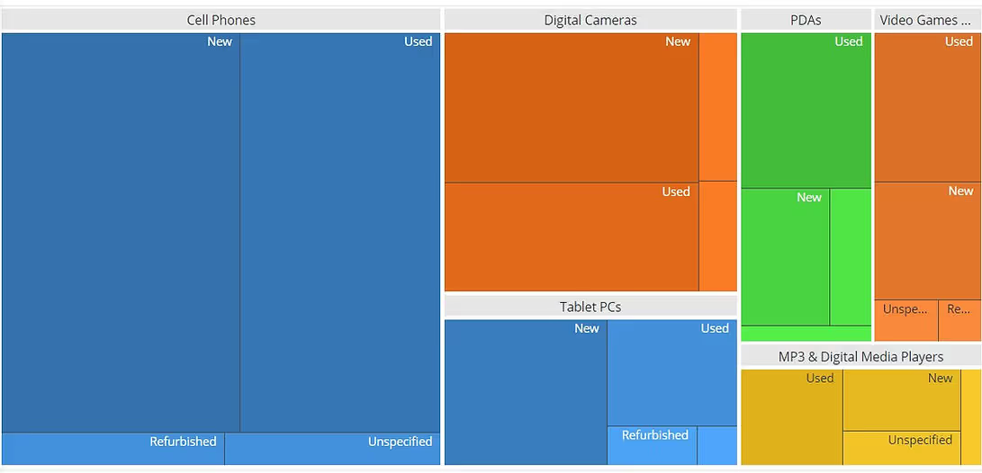
Imagine managing a diverse portfolio of projects within an organization, each with multiple subcategories and associated budgets. In such a scenario, a Treemap becomes a powerful visualization tool. The Treemap allows you to represent the entire project portfolio hierarchically, with each larger rectangle representing a main project and subdivided into smaller rectangles representing subcategories or specific aspects of the project. The size of each rectangle corresponds to the budget allocated to that project or subcategory. This visual representation provides an intuitive and space-efficient way to convey the distribution of resources across the project portfolio.
Drill-Down Treemap
Now, imagine a Drill-Down Treemap as a cool way to zoom into those rectangles. You can click on them to see more details, like going from continents to countries and then to specific cities in a map. This is super useful for exploring specific parts of the data puzzle, like checking sales performance in different regions or understanding the structure of a company from the big boss down to teams.
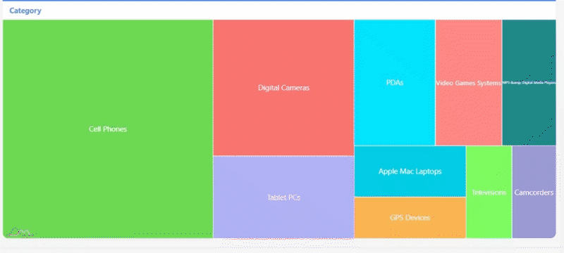
In the context of analyzing organizational expenses, a Drill-Down Treemap serves as a valuable asset. Imagine having a high-level overview of expenditure categories such as marketing, operations, and research. The Treemap allows you to visualize these categories with each block representing a major expense area. Now, introducing the Drill-Down functionality, you can seamlessly delve deeper into any specific category. For instance, clicking on the marketing block might reveal subcategories like digital advertising, events, and campaigns. Each subcategory is represented proportionally, offering a clear picture of the budget distribution within the broader marketing expense.
Other Examples of Application
- Sales Analysis: Drill down into geographic sales data, starting from continents and moving to countries, regions, and even specific stores or branches.
- Healthcare Analytics: Navigate through healthcare data, from general health statistics to specific conditions, treatment outcomes, and patient demographics.
- Product Performance: Examine product sales within broader categories, providing insights into which products are contributing the most to overall revenue.
- Financial Budgeting: Explore budget allocations by breaking down spending categories into subcategories, offering a detailed view of expenses.
The Advanced Drill Treemap plugin, included in Paldi's advanced visualization kit, provides both standard and drill treemaps, presenting a comprehensive array of options for users.
Venn Diagram
A Venn Diagram is a visual representation that illustrates the relationships between different sets of data. It consists of overlapping circles, where each circle represents a set, and the overlapping areas show the elements that are common to those sets. Venn Diagrams are widely used to showcase the similarities and differences between various groups or categories. They help visualize the intersection and distinct elements within datasets, making it easy to understand the relationships between different components. For example, in a business context, a Venn Diagram could be used to display the overlap between customers who purchased product A and those who purchased product B, revealing the shared customer base.
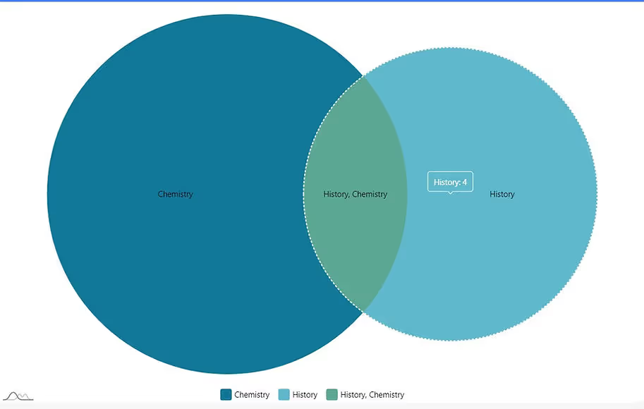
In the realm of market segmentation, a Venn Diagram proves to be an insightful tool for visualizing the overlap and distinctions between different target audience segments. Consider a scenario where a company offers a range of products appealing to various customer demographics. The Venn Diagram allows marketers to represent these demographic segments as circles, each circle indicating a unique customer group based on factors like age, preferences, or geographic location. The overlapping areas in the diagram highlight segments that share common characteristics, providing a visual representation of potential cross-selling opportunities or shared marketing strategies.
Other Examples of Application
- Comparing Social Media Audiences: Visualize the overlap of audience interests between different social media platforms for targeted marketing.
- Examining Technology Features: Compare the features of different technological devices, such as smartphones, laptops, and tablets.
- Customer Behavior in Retail: Categorize customer behaviors in a retail setting, such as shopping online, in-store, or both.
- Analyzing Project Team Skills: Identify the skills common among team members in a project, helping in resource allocation and task assignment.
Paldi's Adaptive Venn Diagram stands out as an excellent choice for Sisense developers, enabling the creation of visually striking and insightful Venn diagrams with ease.
Radial Histogram
A radial histogram, sometimes referred to as a polar histogram, is a type of histogram that displays the distribution of data in a circular arrangement. Unlike traditional histograms that use bars along a single axis, a radial histogram places bins or sectors around a central point, creating a circular or radial pattern.
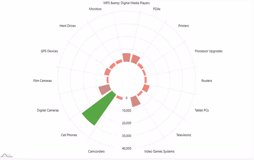
In addition to the circular representation of data distribution, some advanced radial histograms go a step further by supporting more than one dimension to represent categories and their subcategories. This means that additional layers or rings can be used to convey additional dimensions of the data. This enhanced feature allows for a richer and more detailed representation of complex datasets, enabling the visualization of multiple aspects within each radial segment.
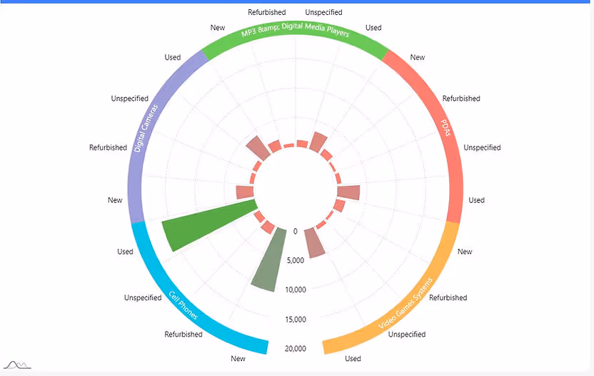
Imagine analyzing the distribution of sales performance across different regions throughout the year in a business report. A Radial Bar Histogram serves as a powerful visualization tool in this scenario. Each bar in the histogram represents a specific region, and the radial arrangement allows for an intuitive comparison of sales figures. The length of each bar corresponds to the sales volume, and the circular layout allows stakeholders to quickly identify regions with the highest and lowest sales. The radial aspect facilitates a visual exploration of regional trends and disparities, offering a unique perspective on the overall sales landscape. This type of visualization proves especially effective when you want to showcase variations in sales performance across multiple regions in a dynamic and visually engaging manner.
Other Examples of Application
- Performance Comparison: Compare the performance of multiple entities across different categories, with each radial bar representing a performance metric.
- Product Feature Comparison: Compare features or attributes of different products in a circular layout, making it easy to identify strengths and weaknesses.
- Skill Proficiency: Illustrate the proficiency levels of individuals or teams across various skills in a radial arrangement.
- Temperature Variation: Showcase temperature variations throughout a day or year, with each bar representing a specific time or month.
Paldi's Adaptive Radial Infographics is a preferred option for Sisense developers aiming to design impressive and advanced radial charts. This tool supports two dimensions and offers a variety of features, including built-in advanced tooltips, enhancing the charting capabilities for a visually compelling experience.
Combined Visualizations
Combining diverse chart types is a powerful strategy in data visualization, enhancing the ability to derive meaningful insights. The fusion of charts, such as Line Charts, Area Charts, Column Charts, and Bar Charts, provides a holistic view of data trends. Sisense facilitates this approach, offering built-in features that seamlessly combine two chart types. The interactive nature of these combined charts elevates the user experience, enabling dynamic exploration and analysis of complex datasets.
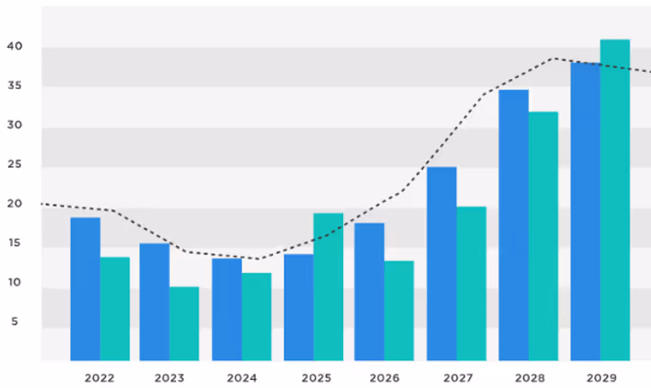
In the context of sales performance analysis, a Combined Chart Type proves highly effective for presenting both actual sales figures and target benchmarks. Imagine a scenario where a company sets quarterly sales targets for its sales teams. By combining a Line Chart to illustrate the actual sales performance over time with a Line or Bar representing the target values, stakeholders can easily compare achieved results against set goals. The Line Chart showcases the fluctuation in sales, while the Target Line or Bar provides a clear reference point for expected performance. This combination allows sales managers to assess team performance in relation to targets, identify trends, and make informed decisions on strategies for meeting or exceeding future sales goals.
Other Examples of Application
- Financial Analysis: Integrate Area Charts to represent overall revenue trends with Column Charts for expense breakdowns, offering a consolidated financial overview.
- Sales and Revenue Analysis: Display multiple sales indicators alongside line charts depicting revenue trends.
- Employee Performance: Present employee performance metrics, integrating line charts to illustrate individual or team achievements over time.
Paldi introduces a game-changing visualization tool, the Indicator Card, which takes combined visualizations to the next level. This advanced plugin not only accommodates multiple indicators in a single widget but also seamlessly integrates line, bar, column, or area charts. Its high interactivity, coupled with features like drill-down capabilities and built-in additional tooltip information, enhances the richness of data representation.
Consider a scenario in project management where you need to present both key performance indicators (KPIs) and the corresponding project progress in a clear and concise manner. The Combined Chart Type, incorporating both an Indicator and Bar Chart, proves to be a powerful solution. The Indicator can represent critical metrics such as completion percentages, while the Bar Chart visualizes the actual progress in various project tasks or phases. This combination allows project managers and stakeholders to quickly assess not only the overall project health through KPIs but also the detailed progress in individual components.
Creating Powerful Dashboards
In today's data-driven world, businesses rely heavily on dashboards to monitor key metrics, track performance, and make informed decisions. However, not all dashboards are created equal. To truly harness the power of data visualization, it's essential to design dashboards with complementary visualizations that provide comprehensive insights at a glance.
Industry Dashboards: Blending Widgets for Optimal Insights
Let's delve into an example of an industry dashboard for a retail chain. Imagine a dashboard that tracks sales performance across different regions, product categories, and customer segments. To effectively convey this information, a combination of widgets works best:
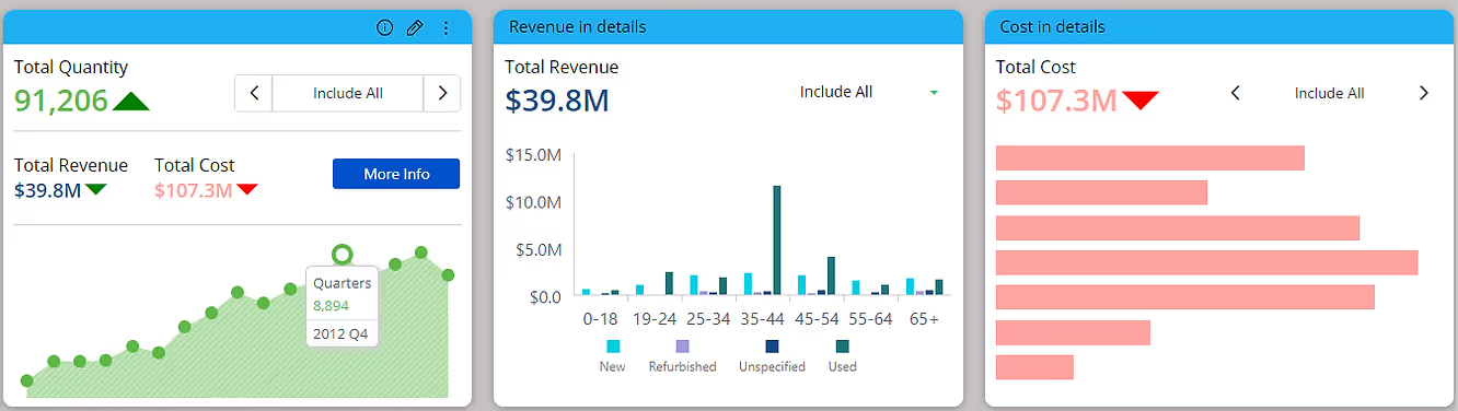
Single Value Indicator: At the helm of our dashboard sits a single value indicator, proudly displaying the total sales revenue for the selected period. This simple yet impactful widget acts as the North Star, guiding users' attention to the primary metric driving business success.
Column Chart: A column chart displays sales figures for each product category, offering a quick comparison of performance. This visual is ideal for identifying top-selling categories and trends over time.
Line Chart: Pairing the column chart with a line chart showcasing sales trends over time adds depth to the analysis. It allows users to spot seasonal patterns, identify sales spikes, and evaluate overall growth trajectories.
Pie of Pie Chart: In a retail context, understanding the distribution of sales across different regions is crucial. A pie of pie chart provides a concise overview of sales distribution by region, with the main pie chart showing total sales by region and the secondary pie chart breaking down again by category.
Drill-Down Treemap: To dive deeper into sales performance within specific regions or product categories, a drill-down treemap offers an interactive solution. Users can navigate through hierarchical data structures, revealing insights at various levels of granularity.
Advanced Sankey Diagram: For analyzing the flow of sales from one stage to another, an advanced Sankey diagram is invaluable. It visualizes the path of sales conversion, highlighting bottlenecks, and opportunities for optimization within the sales funnel.
Radial Histogram: To explore the distribution of sales across different price ranges or customer demographics, a radial histogram offers a unique perspective. Its circular layout provides a visually engaging way to compare frequency distributions.
Enhancing Adoption with Advanced Visualizations
While traditional charts and graphs serve their purpose, incorporating advanced visualizations elevates the dashboard experience and drives higher adoption rates. Here's how:
Enhanced Interactivity: Advanced visualizations, such as Sankey diagrams and drill-down treemaps, offer interactive features that empower users to explore data dynamically. This hands-on approach fosters engagement and encourages users to delve deeper into the insights presented.
Storytelling Capabilities: Complex data relationships and trends are often easier to grasp with advanced visualizations like chord dependency diagrams. By telling a visual story, these diagrams simplify complex concepts, making them more accessible to a broader audience.
Visual Impact: Advanced visualizations add a visual flair to dashboards, capturing users' attention and making data more memorable. Whether it's the elegant flow of a Sankey diagram or the intricate connections depicted in a chord diagram, these visuals leave a lasting impression.
Comprehensive Insights: By combining multiple advanced visualizations within a single dashboard, users gain a holistic view of the data. Each visualization offers a unique perspective, contributing to a more comprehensive understanding of the underlying trends and patterns.
In conclusion, creating powerful dashboards requires careful consideration of complementary visualizations that cater to users' analytical needs. By blending traditional charts with advanced visualizations, such as Sankey diagrams and chord dependency diagrams, businesses can unlock actionable insights and drive informed decision-making. With enhanced interactivity, storytelling capabilities, and visual impact, advanced visualizations pave the way for a more engaging and impactful dashboard experience.
Unleashing Interactive Data Visualization: Sisense BloX vs. Indicator Card
BloX widgets, essentially JSON objects rendered as HTML within your dashboards, provide a highly customizable platform with a rich array of capabilities, including the addition of images, embedding iframes, implementing actions, and collecting user input. Some common BloX use cases involve incorporating multiple KPIs, trend icons, sparklines, and jump-to-dashboard functionality. The Indicator Card simplifies the implementation of these use cases by offering predefined elements and extensive design options, all without the need for coding. Let's delve into the key features of each plugin and explore when to opt for one over the other.
Sisense BloX: A Versatile Framework for Custom Visualization
Sisense BloX is a powerful plugin that empowers users to transform their Sisense dashboards into dynamic and interactive experiences. With BloX, you can create rich widgets using JSON objects rendered as HTML, allowing for highly customizable content. It offers extensive interactivity and data collection options, making it ideal for those with coding skills seeking to build content-rich applications within their dashboards. However, the trade-off is that creating BloX widgets may be time-consuming and require a proficiency in coding.
Some of the key features of Sisense BloX include:
Dynamic Widgets: Sisense BloX allows you to create dynamic, rich widgets, enhancing your dashboard's interactivity.
Customizable Content: You can use JSON objects to customize the content of your BloX, allowing for a high degree of flexibility in design.
Interactive Actions: BloX supports multiple types of actions, enabling you to create content that responds to user interactions.
Data Input: You can collect input from users through BloX widgets, making it possible to use them for data collection and feedback.
Images to the widget: With Sisense BloX, you can effortlessly add images to your widgets, enhancing the visual appeal of your content.
Embed iFrames: The ability to embed iFrames in BloX widgets allows you to seamlessly integrate external content into your dashboards.
However, it's important to note that Sisense BloX does require coding skills and can be time-consuming to set up, making it best suited for users who are comfortable with coding.
Indicator Card: Effortless Visualization for Everyone
On the other hand, the Indicator Card is designed with accessibility in mind. It is a game-changer in the world of data visualization. This plugin is tailor-made for simplicity, ensuring that designers without coding backgrounds can easily harness its capabilities.
Key features of the Indicator Card include:
Designer-Friendly: Indicator Cards are designed to be more accessible to non-coders, making it easier for designers to create visualizations.
Supports Various KPIs: Indicator Cards can display multiple Key Performance Indicators (KPIs) with ease, simplifying the process of presenting data.
Trend Icons for KPIs: This plugin offers the option to add trend icons to your KPIs. These icons provide visual cues about the direction of data trends.
Sparkline Chart Integration: You can choose from various visualization types, including bar, column, line, and area charts, making it versatile for different data types.
Additional Tooltip Information: Indicator Card supports the inclusion of additional information in tooltips, accommodating both dimensions and measures.
Customizable Tooltips: Indicator Cards allow for customizable tooltips, without the need for coding, to provide additional information when users interact with the data.
Advanced Jump-to-Dashboard: You can easily configure advanced jump-to-dashboard features without needing to write code, enhancing user experience.
Interactivity: All KPIs within the Indicator Card are interactive, allowing users to change the value axis of the sparkline by clicking on any KPI.
Filter Like a Pro: For refined data exploration, you can integrate a filter box within the Indicator Card. This allows you to efficiently filter all elements within the widget, boosting the interactivity and utility of your visualization.
Design Freedom: In addition to these features, the Indicator Card offers an array of design options to shape the look and feel of your visualizations. This ensures that your visualizations seamlessly align with the overall design of your dashboard.
Choose between Indicator Card and Blox
In summary,Sisense BloX and the Indicator Card are two valuable tools for creating dynamic and interactive content. Sisense BloX is a feature-rich plugin that allows users to create highly customized widgets using JSON, HTML, and CSS. However, it demands coding skills and can be time-consuming for those less experienced in programming.
On the other hand, the Indicator Card simplifies the process of data visualization. All elements of Indicator card including KPIs, sparkline, trend icons, tooltip, Jump-to-dashboard, filter box etc are highly customizable – all without requiring any coding expertise. The choice between these tools depends on your specific requirements and your team's level of coding expertise.
Understanding the Role of Filters in Sisense
In the realm of data analysis and visualization, the power of filters cannot be overstated. Filters allow users to refine their data, focus on specific subsets, and extract valuable insights. Sisense, as a leading business intelligence platform, offers a robust set of filtering capabilities that empower users to tailor their analyses to their precise needs. In this guide, we will delve into the world of Sisense filters, exploring their functionality, customization options, and best practices. Additionally, we'll highlight how Paldi filter plugins can enhance the filtering experience within Sisense.
Understanding Star Schema and Dimensional Modeling
Filters play a pivotal role in Sisense dashboards, serving as indispensable tools for refining and analyzing data with precision and efficiency. By allowing users to focus on specific subsets of data, filters empower them to extract actionable insights and make informed decisions. Within the context of Sisense's architecture, the importance of filters is amplified, especially in conjunction with the star schema data model.
In the star schema, dimensions are segregated into their own tables, facilitating optimized data management and query processing. This structural approach streamlines data retrieval and analysis by separating descriptive attributes (dimensions) from measurable quantities (facts), thus enhancing the clarity and efficiency of data modeling. When filters are applied within Sisense dashboards, the system dynamically establishes joins between the fact table and the relevant dimension tables. This process enriches the data with contextual information, enabling users to delve deeper into their analyses while maintaining data integrity.
Behind the scenes, Sisense leverages these joins to incorporate a 'where' clause in the SQL queries generated for each widget, ensuring that the data displayed is filtered based on the user's selections. This seamless integration of filters into the querying process not only enhances the relevance and accuracy of insights presented but also optimizes query execution times, bolstering overall dashboard performance.
Furthermore, in scenarios where multiple fact tables are present, the star schema proves invaluable. Both fact tables connect to dimension tables, ensuring that when a filter is applied to a dimension, data from all relevant fact tables is filtered accordingly. This capability enables users to conduct comprehensive analyses across disparate data sources, fostering a holistic understanding of their data landscape.
Safeguarding Data Privacy in Sisense Dashboards
In the dynamic landscape of data security within business intelligence, a critical consideration revolves around presenting aggregated values to viewers while safeguarding granular data from unauthorized access. This balancing act is particularly crucial in scenarios where sensitive information, such as individual employee salaries, must be protected due to privacy and security regulations. For instance, while it's acceptable to display aggregated salary metrics like average departmental salaries or total monthly payroll, revealing individual salary details poses a significant risk. However, the introduction of filters within dashboards can potentially breach this security by allowing viewers to infer granular information. Consider a scenario within the IT department, where most employees are above 30 years old except for one individual aged below 25. If a dashboard features filters based on department and age group, viewers could easily discern details about the younger employee by filtering for "department=IT" and "age group=20-30." This unintended revelation of sensitive data underscores the importance of vigilance when selecting filter fields and crafting dashboards.
To address this challenge, organizations must exercise caution when selecting filter fields and constructing dashboards within Sisense. By carefully evaluating the potential implications of filter usage and considering the sensitivity of the underlying data, organizations can mitigate the risk of unintentional data exposure and maintain compliance with regulatory standards. Also there is a powerful plugin available, called Avoid Over Filtering offered by Paldi Solutions, aimed at enhancing data security within Sisense dashboards.
Elevating Filter Styling
Consistency in filter styling holds significant importance within Sisense as it directly impacts the overall user experience and perception of the dashboard. Filters serve as essential navigational tools, allowing users to interact with and explore data sets effectively. When filters seamlessly integrate with the dashboard's design language, users can navigate through data more intuitively, leading to improved comprehension and analysis. Moreover, visually cohesive filters contribute to a polished and professional dashboard aesthetic, reinforcing the credibility of the data presented and instilling confidence in users. In scenarios such as OEM deployments, where brand consistency is paramount, aligning filter styles with the overall dashboard design becomes even more critical, as it ensures that the user experience remains consistent across various platforms and deployments.
In Sisense, achieving consistent filter styling involves leveraging the platform's built-in customization features alongside additional plugins for enhanced flexibility. Sisense provides native options to adjust filter colors, allowing users to match filter aesthetics with other dashboard elements. However, for more advanced customization and styling capabilities, users can opt for plugins such as those offered by Paldi Solutions. Paldi's filter plugins offer extensive customization options, enabling users to tailor filter aesthetics with precision.
Enhancing User Experience with Advanced Filter Features
User experience with filters is paramount, as it can greatly enhance the efficiency and depth of data analysis. Providing additional features around filters can offer users valuable tools to navigate and analyze data more effectively. Here are some of the features that can be considered while working with filters.
1. Reset Filters
Resetting filters to their default state after applying multiple selections is a valuable feature that enhances user experience in data analysis. This functionality allows users to easily revert back to the original filter settings, providing a convenient way to start anew with their analysis. Thankfully, Sisense includes a built-in option to reset filters, ensuring users can effortlessly return to the default filter configuration whenever necessary.
2. Filter Bookmark
Filter bookmarking, or the ability to save current filter selections for future use, greatly improves user productivity and efficiency in data analysis workflows. With this feature, users can quickly apply previously saved filter configurations, streamlining the analysis process and eliminating the need to manually recreate complex filter setups. Paldi's Filter Bookmark plugin is a valuable addition to Sisense, offering users an intuitive tool for saving and recalling filter settings with ease, thereby enhancing the overall user experience within the platform.
3. Easy Filter Field Discovery
Facilitating easy discovery of specific filter fields within a dashboard is essential for improving usability, especially in scenarios where numerous filters are present. Without such functionality, users may struggle to locate specific filters, leading to frustration and inefficiency. While Sisense lacks a built-in option for this feature, external plugins such as Paldi's Filter Catalog can fill this gap.
Harnessing the Power of Sisense Filters
Sisense caters to diverse data types, seamlessly accommodating various filtering requirements.
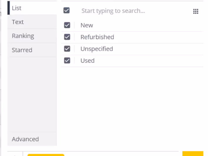
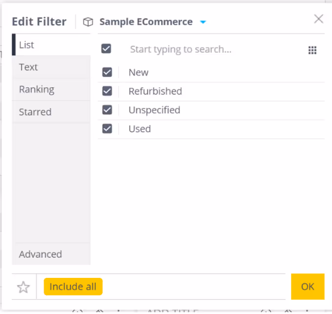
Text Field Filters
For text dimension columns, Sisense offers a diverse range of filtering options, allowing users to include or exclude specific items, filter based on text containment or starting patterns, and more, ensuring granular control over data selection. However, for those seeking heightened customization and flexibility, Paldi's Advanced Filters plugin emerges as a compelling alternative, providing extensive options to tailor the look and feel of filter widgets.
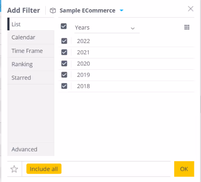
Date Field Filters
In Sisense, date dimensions empower users to filter data across various granularities, from day to year, facilitating comprehensive temporal analysis. With functionalities like date range selection and predefined presets such as "last 3 years" or "last 12 months," users can efficiently narrow down temporal data to derive meaningful insights. However, for those seeking additional customization and ease of use, Paldi's Date Range filter plugin presents a compelling alternative.
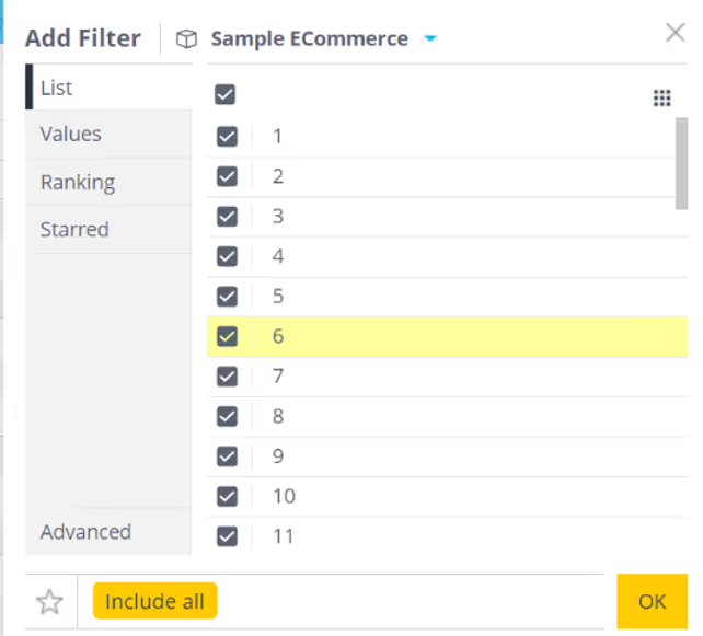
Numeric Field Filters
Numeric dimensions afford users the flexibility to filter data based on numerical criteria, including greater than, less than, or equal to specific values. This capability, coupled with Paldi plugins, empowers users to refine their analyses with precision.
Levels of Filters in Sisense
Sisense offers three tiers of filtering granularity:
Dashboard Filters: Dashboard filters are applied at the dashboard level in Sisense, impacting all widgets within the dashboard. Users have the flexibility to modify these filters to suit their analytical needs. By adjusting these filters, viewers can refine the data displayed across multiple widgets, enabling comprehensive analysis tailored to specific criteria.
Widget Filters: Widget filters are applied within individual widgets, providing targeted data refinement within specific visualizations. When the same field is utilized in both dashboard and widget filters, only the widget filter takes precedence for that widget, overriding the dashboard filter. It's important to note that viewers do not have the ability to modify widget filters; only dashboard designers can make changes to these filters, ensuring consistency and control over data presentation within widgets.
Formula Filters: Formula filters are applied within analytical formulas and offer fine-grained control over data manipulation. When the same field is designated as a dashboard filter, widget filter, and formula filter, the formula filter takes precedence. This means that only the criteria specified in the formula filter will be applied, while the dashboard and widget filters will be disregarded. Similar to widget filters, formula filters can only be applied by dashboard designers, ensuring that complex data manipulations are executed with precision and accuracy.
Conclusion
Effective filtering is integral to extracting actionable insights from data within Sisense. By leveraging a combination of built-in filtering options and Paldi filter plugins, users can streamline analysis workflows, enhance usability, and unlock the full potential of their data. With the right filtering strategies in place, organizations can make informed decisions and drive business success.
Sisense Dashboard Performance Optimization
Optimizing Sisense Dashboard Performance: A Comprehensive Guide
Sisense dashboards are designed to transform complex data into actionable insights. However, performance issues, such as slow loading times or timeout errors, can hinder their effectiveness. Identifying the root causes of these issues is crucial to ensure optimal performance. This guide provides a structured approach to troubleshooting and resolving common performance problems in Sisense.
Key Areas to Investigate
Performance issues often stem from one or more of the following areas:
- Data Model
- Dashboard Design
- Server Configuration and Network
- Environment Cleanup
Let’s explore each of these areas in detail and how you can address potential performance issues.
1. Data Model
Each widget on a Sisense dashboard generates a query to retrieve and display data. The speed of these queries can have a significant impact on dashboard performance. Slow queries often occur due to inefficient relationships or an excess of complex joins.
- Many-to-Many Joins: When two tables are joined with duplicate keys, the result is unnecessary duplication of records, which consumes excessive computing resources and leads to slower performance. It's essential to verify the cardinality of relationships and adjust them to One-to-Many or One-to-One where applicable. This ensures more efficient querying and reduces the load on the system. Learn more about troubleshooting many-to-many relationships.
Example of Many to Many: We have two tables: Products and Customers. Both tables contain a Category field:
Products Table:
Customers Table:
If we attempt to join the Products and Customers tables on the Category field, we create a Many-to-Many relationship. This occurs because:- Multiple products belong to the same category (e.g., Electronics has both Laptop and Smartphone).
- Multiple customers are associated with the same category (e.g., both Alice and Bob prefer Electronics).
- Excessive Joins: When large fact tables are joined with multiple dimension or lookup tables, the resulting queries can become very complex and resource-intensive. These complex queries require significant processing power to merge large datasets from different tables, which can lead to slower performance and longer load times, especially with large volumes of data. The more joins you have, the more SQL operations need to be executed, consuming more memory and resources, which impacts dashboard performance. To reduce the impact of excessive joins, one solution is to reorganize your data model into a more efficient structure.
A common approach is to use a flat table schema, where all the relevant data is denormalized into one single table. This eliminates the need for joins, improving query performance but increases the size of the database due to data redundancy. Alternatively, a star schema is often used, where a central fact table (e.g., Sales Transactions) is linked to multiple dimension tables (e.g., Products, Customers). This reduces the number of joins, making queries less complex and more efficient while maintaining a manageable database structure. Using a star schema, for example, allows the fact table to quickly reference the dimension tables, resulting in faster queries and better overall performance in dashboards. Check out these resources: Flat Table Schema, Star Schema.
- Data Types of Key Fields: Using numeric fields for joins instead of lengthy string fields can significantly improve query performance, especially when dealing with large datasets. Numeric fields are processed more efficiently because they require less memory and CPU to compare, as they are stored in a compact, fixed-size format. In contrast, string fields, especially long or variable-length strings, take up more memory and require additional processing to match during joins. This difference becomes especially noticeable when scaling dashboards or working with complex data models, as numeric joins can reduce query execution time and prevent performance bottlenecks. To optimize performance, consider using integers or other numeric data types as key fields in joins whenever possible.
- Relevance of Imported Data: The size of data directly affects query performance. Import only the relevant data required for analysis and avoid including unnecessary columns or historical data. In some cases, importing aggregated data instead of raw data can also reduce query time and storage requirements.
For instance, if you only need to analyze total sales by customer for the past month, importing raw data with every transaction or irrelevant details like shipping addresses can create unnecessary duplication. Instead, importing just the relevant columns or even pre-aggregated data, such as the total amount spent by each customer, can drastically improve query efficiency and reduce system load.
- Field Indexing: For live models, it is crucial to ensure that key fields are properly indexed. Field indexing significantly enhances query performance by reducing the time required to retrieve data. When fields are indexed, the system can quickly locate the necessary data, leading to faster query results and an overall improved dashboard experience.
- Using Views vs. Tables: When working with live models, it’s important to understand the performance impact of using views versus tables. A view is essentially a stored query that retrieves data from one or more tables, but every time a query is executed on a view, it triggers an additional query behind the scenes to fetch the data. This extra layer of query execution can significantly slow down performance, especially when dealing with large datasets or complex joins. Since views are essentially virtual tables, each time you query a view, the system needs to process the underlying query, which can increase query execution times and result in slower dashboard performance.
On the other hand, using tables provides direct access to data, which allows queries to be executed more efficiently. When you query a table, you're accessing the data directly without any intermediary steps, leading to faster query execution times. For optimal performance, it’s recommended to use tables whenever possible, as they minimize the additional overhead involved in querying. This approach is especially helpful in situations where speed is critical, such as when real-time or near-real-time data retrieval is necessary. By using tables, you can ensure that queries are processed more quickly, improving overall dashboard performance.
2. Dashboard Design
Even with an optimized data model, dashboard design plays a critical role in performance. Poor design can lead to slow query execution and long loading times.
- Complex Calculations: Complex calculations within widgets generate large, resource-intensive SQL queries. These queries are executed every time a filter is applied or the dashboard is refreshed, which increases loading times. To mitigate this, consider pre-calculating complex formulas in the data model rather than in the dashboard, so the system retrieves values directly from the table without having to execute complex queries each time.
Imagine a dashboard that tracks employee performance, and one of the metrics is the Employee Efficiency Ratio, calculated as:
(Total Tasks Completed / Total Hours Worked) * 100.
If this calculation is performed within the widget, the widget has to perform this calculation each time it refreshes, or when filters such as team or month are changed. This can slow down performance, especially when dealing with large datasets. A more efficient approach would be to pre-calculate the Employee Efficiency Ratio in the data model, creating a new column for it. This way, the dashboard can simply retrieve the pre-calculated value, improving load times and overall performance.
- Displaying Large Volumes of Non-Aggregated Data: Fetching large datasets without aggregation can severely slow down performance, especially when showing row-level data in pivot tables or charts. Sisense has to process and store the data on the web server before it can be displayed visually, which can significantly increase loading times. Aggregating data in the model before displaying it on the dashboard helps reduce the amount of data being processed. Additionally, consider using Sisense add-ons like Accordion and Jump-to Dashboard to allow users to access detailed data on demand without burdening the main dashboard. Accordion Add-on, Jump-to Dashboard Add-on.
- Number of Widgets: Having more widgets on a dashboard means more SQL queries are executed, leading to greater resource consumption and longer loading times. Sisense recommends limiting dashboards to 6-8 widgets for optimal performance. If you need more, consider using the Lazy Loading plugin, which ensures that only visible widgets execute queries, while non-visible widgets wait until they are scrolled into view. This reduces unnecessary resource usage and improves dashboard speed.
Lazy Loading Plugin.
For live models, using the Lazy Loading plugin will also help reduce cloud DWH costs by minimizing the number of queries sent to the database.
- Query Optimization: Sisense offers a Query Optimizer plugin that dynamically restructures queries, improving execution time and reducing load on the system. This is especially helpful when dealing with complex or large queries. Query Optimizer Plugin.
- Default Filters: Setting default filters is a simple but effective way to improve dashboard performance. By pre-setting filters to display only relevant data—such as showing only the current month’s data by default—you limit the amount of data loaded when the dashboard is first accessed. This reduces the processing time needed to display the data, ensuring that the dashboard loads faster and more efficiently.
Since each filter added to a dashboard and every user selection generates a new query to the database, it's important to use filters strategically. Exploring different filtering solutions can help optimize performance.
For example, if your dashboard contains data for multiple months, applying a default filter that limits the view to the current month ensures that only a smaller subset of data is queried and displayed. Not only does this improve the performance of the dashboard, but it also helps users focus on the most relevant and meaningful insights right away, without having to sift through large volumes of irrelevant information.
To support this, you can use the free Adaptive Default Filters plugin to set smart default filters based on user or date logic, and the free Hide Filters plugin to keep your dashboards clean while maintaining filter functionality in the background.
3. Server Configuration and Network
In addition to optimizing the data model and dashboard design, your server and network infrastructure also play a critical role in Sisense performance.
- System Requirements: Sisense has specific hardware and software requirements to ensure optimal performance. If your system doesn't meet these minimum requirements, performance may suffer. Refer to Sisense’s system requirements on Windows or Linux to ensure that your infrastructure is appropriately configured.
- Network for Live Models: If you are using a live model that queries data directly from the source, the speed of your network connection to the data source is crucial. A slow network can significantly delay query execution. To improve performance, ensure that the network connection to your data source is fast and stable.
- Database Performance: The efficiency of the database system, especially when using a live connection, directly affects query processing time. Ensure that the database is properly optimized and capable of handling large volumes of data and concurrent user requests. A slow or poorly configured database will lead to slower query execution, negatively impacting dashboard performance.
4. Environment Cleanup for Improved Performance
Regular maintenance of your Sisense environment is essential to sustain good performance. Over time, unnecessary data, dashboards, and users can accumulate, putting unnecessary strain on system resources.
Some best practices for maintaining a clean environment include:
- Remove Test Dashboards: Delete any test dashboards that are no longer needed.
- Delete Unused Elasticubes: Regularly remove old or unused Elasticubes to free up system resources.
- Remove Inactive Users: Ensure that only active users are listed in your Sisense environment.
- Turn Off Unused Plugins: Disable any plugins that are no longer in use to save resources.
- Disable Irrelevant Email Reports: Turn off any scheduled email reports that are no longer necessary.
By regularly cleaning up your environment, you can ensure optimal performance and avoid unnecessary resource consumption.
Conclusion
Optimizing Sisense dashboard performance requires attention to detail across multiple areas, including data model optimization, dashboard design, and server/network configuration. By following the best practices outlined above, you can significantly improve performance, ensuring that your dashboards load quickly and provide a seamless user experience.
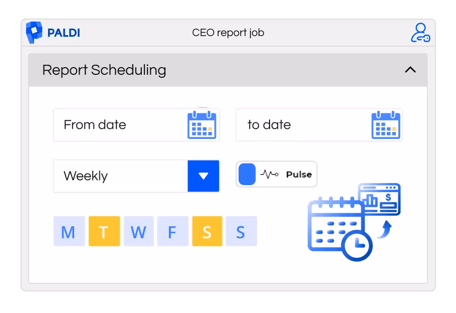
Navigating Business Insights: The ABCs of BI Reporting
Mastering BI Reporting
What is BI Reporting?
BI (Business Intelligence) reports are structured documents that summarize data and insights across key business areas. Often referred to as static reports, they are generated by BI tools that collect, analyze, and visualize data from multiple sources.
Why Do You Need BI Reporting?
In today's fast-paced business environment, having quick access to relevant data is essential for effective decision-making. BI reporting helps make sense of complex data and transforms it into timely, actionable insights.
Imagine a scenario: a sales manager overwhelmed by spreadsheets while trying to assess regional performance. BI reporting simplifies this task. With just a few clicks, the manager can export a focused report directly from the dashboard—covering sales metrics, customer segments, or product trends. These reports, often in formats like CSV, Excel, or PDF, enable fast, informed decision-making.
Use Cases Solved by BI Reporting
Many contemporary business intelligence (BI) platforms now offer capabilities for generating reports, making these features standard in the BI landscape. Users can also enhance their BI experience by integrating third-party plugins or tools, thereby unlocking additional features. Some common use cases include:
- Financial Performance Report: Summarizes financial metrics such as revenue, expenses, profitability, and cash flow, enabling executives to assess the organization's financial health.
- Marketing Campaign Analysis: Evaluates the effectiveness of marketing campaigns by analyzing metrics like click-through rates, conversion rates, and return on investment (ROI).
- Customer Segmentation Report: Segments customers based on demographic, behavioral, or psychographic attributes, facilitating targeted marketing and personalized customer experiences.
- Supply Chain Optimization Report: Identifies bottlenecks, inefficiencies, and optimization opportunities within the supply chain, enhancing operational efficiency and reducing costs.
- Employee Performance Report: Tracks employee productivity, performance metrics, and key HR KPIs to optimize workforce management and talent development strategies.
Challenges in BI Reporting
BI reporting involves not just getting data from BI dashboards to the right people, but doing it efficiently.
Here are some key characteristics of BI reports:
- Static Nature: Unlike interactive dashboards or real-time analytics, static reports are fixed documents that present data at a specific point in time. They don't allow for user interaction or dynamic updates.
- Structured Format: BI reports usually follow a structured format with predefined sections such as summaries, charts, tables, and key performance indicators (KPIs). This format helps stakeholders quickly grasp important information.
- Data Visualization: While they often include visual elements like charts, graphs, and diagrams, the challenge is ensuring these visualizations effectively highlight trends, patterns, and outliers within the data.
- Scheduled Distribution: Ensuring timely delivery to relevant stakeholders is crucial, but scheduling and managing this distribution can be complex.
- Customization: While static reports can be customized to some extent, they lack the interactivity of dynamic dashboards, which may limit their usefulness for some users.
Popular BI Report Formats and Their Advantages:

1. CSV (Comma-Separated Values):
- Advantages:
- Universally recognized format, compatible with most data analysis tools.
- Lightweight and easy to generate, facilitating quick data transfers and integrations.
- Use Cases:
- Importing data into spreadsheet applications like Microsoft Excel or Google Sheets for further analysis.
- Sharing raw data with analysts or stakeholders for custom analysis and processing.
2. Excel:
- Advantages:
- Robust data manipulation capabilities, including pivot tables, charts, and formulas.
- Familiar interface and widespread adoption, making it accessible to a wide range of users.
- Use Cases:
- Conducting in-depth data analysis and exploratory data visualization.
- Creating comprehensive reports with detailed insights and interactive elements.
3. PDF (Portable Document Format):
- Advantages:
- Preserves formatting and layout across different devices and platforms.
- Ideal for creating polished, professional reports suitable for distribution and presentation.
- Use Cases:
- Distributing standardized reports to stakeholders with consistent formatting.
- Creating documentation or whitepapers requiring a fixed layout and structure.
4. PowerPoint (PPT):
- Advantages:
- Facilitates the creation of visually engaging presentations with slides, images, and animations.
- Supports storytelling and narrative-driven presentations, enhancing the impact of the insights.
- Use Cases:
- Presenting key findings and recommendations to executive stakeholders or clients.
- Creating dynamic, interactive dashboards or data-driven presentations for meetings or workshops.
Different Methods of Report Delivery
There are various methods through which users can access BI reports. If you require immediate access to the report, you can directly export it from the tool or BI platform. Alternatively, you can opt to schedule the report, ensuring that it is delivered to you via email or message on designated days.
Scheduling:
Scheduling refers to the automated process of generating and sending reports or data extracts from a dashboard at specific intervals or times. This feature allows users to stay updated with the latest insights without having to manually access the dashboard each time. For example, a marketing manager may schedule a weekly report to be sent every Monday morning summarizing key metrics like website traffic, conversion rates, and campaign performance.
Scheduling functionality typically offers customization options to tailor the report delivery to specific user preferences and requirements. Scheduling reports in Business Intelligence (BI) platforms offers a diverse array of delivery options beyond traditional email dispatch. These options include FTP (File Transfer Protocol), collaborative platforms like Slack and Microsoft Teams, and more. Users can schedule reports to be automatically emailed as attachments or embedded links, ensuring widespread accessibility and visibility. Additionally, reports can be uploaded to an FTP server at specified intervals, facilitating secure file transfer for recipients to retrieve the reports from a designated location.
Integrations with collaborative platforms enable users to schedule reports for posting to dedicated channels or chat threads, promoting real-time sharing and discussion among team members. Furthermore, some BI platforms offer APIs and webhooks for custom integrations with third-party applications, allowing users to extend the reach of BI insights to custom endpoints. This multi-channel delivery approach enhances accessibility, promotes collaboration, and accommodates diverse user preferences and organizational requirements, thereby maximizing the impact of BI initiatives.
Let's delve into some essential considerations for effective report scheduling:
- Data Security and Relevance: It's essential to prioritize data security and relevance when scheduling reports. This means ensuring that reports are only accessible to relevant users and that access permissions align with organizational data policies. By controlling who can access what information, organizations can minimize the risk of unauthorized data exposure and maintain compliance with privacy regulations.
- User Relevance and Subscription: Reports should only be subscribed to by users who have a genuine need for the information contained within them. This ensures that users aren't inundated with irrelevant data, which can lead to information overload and decreased productivity. By tailoring report subscriptions to specific user roles or departments, organizations can ensure that users receive only the information they need to perform their job responsibilities effectively.
- Understanding User Preferences: To maximize engagement and usability, it's essential to understand users' preferences regarding data frequency and format. Some users may prefer to receive reports daily, while others may only need them on a weekly or monthly basis. Similarly, users may have preferences regarding the format of the reports they receive, such as PDF, Excel, or CSV. By accommodating these preferences, organizations can ensure that users are more likely to engage with and derive value from the scheduled reports they receive.
- Dynamic Values and Matrices: Certain reporting platforms or their third-party plugins offer the functionality to incorporate matrices and dynamic content directly into both the email body and subject line. This ensures users are instantly aware of critical trends or areas requiring attention.
Imagine a marketing director receiving a scheduled report with the subject line "Campaign Click-Through Rate Down 5% This Week." This level of immediacy, achieved through dynamic values, empowers recipients to grasp key insights at a glance before even opening the report.
Exporting:
Exporting data from a BI dashboard serves as a fundamental mode of BI reporting, enabling users to extract valuable insights for further analysis, sharing, or documentation. This mode allows users to seamlessly transition from the visualization-centric environment of the dashboard to external tools or formats, facilitating deeper exploration and utilization of the data. Whether users require raw data for statistical analysis, formatted data for presentations, or archival records for documentation, exporting provides the flexibility to accommodate diverse reporting needs. By offering various export formats such as CSV, Excel, PDF, and others, BI platforms ensure compatibility with different tools and workflows, enhancing usability and accessibility for users.
For instance, analysts may export sales data to CSV format for importing into statistical software to conduct advanced analytics, while executives may prefer Excel or PDF formats for crafting comprehensive reports or presentations. Exporting thus serves as a crucial mode of BI reporting, empowering users to leverage data insights effectively across various contexts and decision-making processes within the organization.
In conclusion, BI reporting plays a vital role in driving informed decision-making and enhancing organizational performance. These reporting mechanisms transform complex data into actionable insights, enabling stakeholders to monitor key metrics, track trends, and identify opportunities for improvement. By providing structured, visually engaging reports in formats tailored to user preferences, BI reporting fosters collaboration, facilitates communication, and empowers users at all levels to make data-driven decisions.
Moreover, the integration of scheduling and exporting features ensures timely access to critical insights and facilitates deeper analysis, enabling organizations to stay agile and responsive in today's fast-paced business environment. As BI technologies continue to evolve and democratize access to data insights, the significance of BI reporting as a catalyst for organizational success and innovation will only continue to grow.
With the importance of BI reporting established, let’s explore how these needs are addressed within the Sisense platform — through both native functionality and certified extensions.
Extending BI Reporting in Sisense
Sisense continues to lead the way in empowering organizations with rich data experiences and dynamic dashboards. As part of this robust platform, Sisense offers a range of reporting options to help users distribute insights across their organizations — from simple exports to advanced scheduling.
This section outlines the key solutions available within the Sisense ecosystem, including native capabilities and certified add-ons that enhance flexibility and automation.
Sisense Built-In Email Scheduling
Out of the box, Sisense provides a native email scheduling tool that allows users to export dashboards as PDFs and send them at scheduled times. This functionality is ideal for teams needing straightforward, scheduled distribution of dashboards in a polished format.
Key strengths:
- Seamless dashboard export as PDF
- Simple scheduling through the Share interface
- Great for standardized updates or recurring snapshots
This built-in feature is ideal for quick wins and regular stakeholder updates, especially where advanced customization is not required.
Sisense Report Manager Add-On
Sisense Report Manager is ideal for enterprise-grade scheduling, especially when delivery to external users, archiving, or governance is required. It offers a high degree of flexibility and provides a strong foundation for scaling reporting across the organization. Designed for more robust use cases than the out-of-the-box feature, it includes:
- Support for PDF, Excel, CSV, and dashboard links
- Time-based and event-based scheduling
- Recipient targeting, including external (non-Sisense) users
- Report archiving via local paths or SFTP servers
- Role-based access, allowing even Viewer users to create and schedule reports
- A centralized UI for managing reports, including bulk operations
- Customizable email templates and multi-language support
- Ability to include custom filters and set report priority
While highly capable, there are a few constraints:
- Dynamic content insertion (e.g., KPIs in email subjects) requires template-level scripting
- No built-in support for per-report format settings or filter presets by job
- Branding, layout, or file naming customization is limited to predefined structures
- Multi-tenancy and dashboard co-authoring support is partial in current versions
Paldi Report Manager Add-On
As reporting needs grow more complex, many Sisense users seek even more granular control over report design, content personalization, and delivery flexibility. Paldi Report Manager, a certified Sisense add-on, was built to meet these needs — offering advanced features that extend the core capabilities of Sisense Report Manager in a no-code, UI-driven way.
Key advantages include:
- Multi-format delivery: PDF, Excel, and CSV (individually or combined)
- Flexible destinations: Email, S3 bucket, or both
- Dynamic values: Inject KPIs, filter values, and dashboard metadata into email subjects, bodies, and report titles
- Per-report customization: Separate filters, formats, and layout per job
- No scripting required: Dynamic templates and report logic available via the UI
- User-friendly installation: Seamlessly deployed and fully integrated into Sisense
- Optimized for performance: Lightweight and smooth even under high concurrency
Conclusion
BI reporting remains a cornerstone of data-driven decision-making. By transforming complex information into clear, structured insights, reporting tools empower teams to monitor key metrics, identify trends, and act with confidence. Whether through static exports or automated scheduling, timely and accessible reporting helps organizations stay aligned and responsive in a fast-moving business landscape.
Within the Sisense ecosystem, a range of solutions supports this need — from native scheduling features to advanced tools like the Sisense Report Manager. For organizations requiring even greater flexibility, personalization, and control, Paldi Report Manager offers a certified extension purpose-built to elevate the reporting experience in Sisense.
Explore More on BI Reporting with Paldi
Looking to dive deeper into how organizations are using Paldi Report Manager or want to get hands-on?
- GeriMedica Case Study
See how GeriMedica enhanced their reporting workflows using Paldi Report Manager. - Paldi Report Manager – Product Page
Explore features, benefits, and supported configurations. - Paldi Report Manager – How-To Series
Step-by-step tutorials to help you make the most of your reporting setup.

How To Filter Multiple Dates with one action
This article will demonstrate how to create one simple date filter in the dashboard that is connected to as many date fields as needed, allowing the user to select one time frame and view the measures without hassle.
Some cases where you might want to filter multiple date fields include:
- If you want to allow your users to filter multiple date fields, you know they will filter the same time period in all of the filters but you have no choice but to give them multiple date filters to use.
In cases where there are different date fields in the same fact table you have to either:
- Split the table to multiple fact tables and connect them to a main DimDates table
- Pivot the data to contain fields of ‘date’ and ‘date type’, creating huge duplications of data, messy modeling, and many different date filters in the same dashboard.
The above solutions, although helpful, are hard to perform and maintain, especially if you already have an existing cube in production and you’re worried about changing it and about the performance and stability of the whole solution.
- Another case this solution may help you with is if you have the same date field in different timezone adjustments - you might want to filter the different timezone fields to the same date range to catch all data in this range.
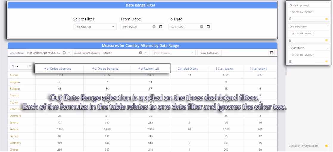
Prerequisites:
- Install Paldi Solutions Date Range Filter
- Install Sisense Filtered Measures
In the following example we will treat three date fields, two of them in the same fact table, and the third one in a different table. The cube does not contain a DimDates table.
We want to create a widget that will show for each country:
- Number of Approved Orders
- Number of Delivered Orders
- Number of Reviews
Those measures should all need to be reflected by the same date range selection, but there are three different date fields to filter.
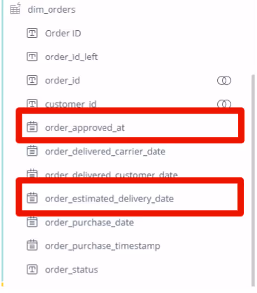
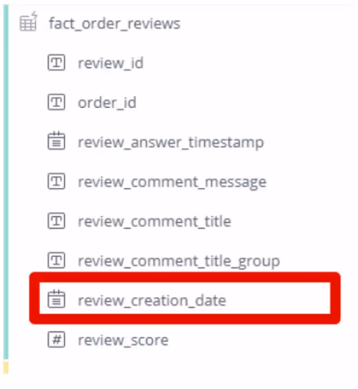
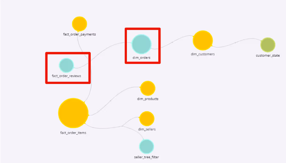
Steps:
- Create a new Date Range Filter widget with the required fields:
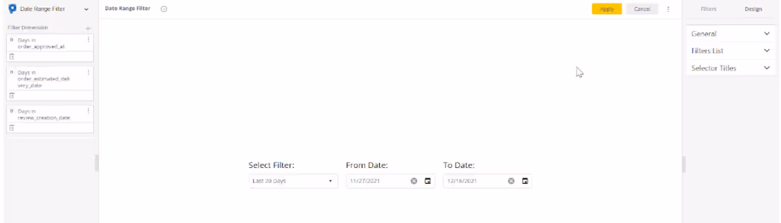
2. Add the fields as dashboard filters and rename them for easier usage:
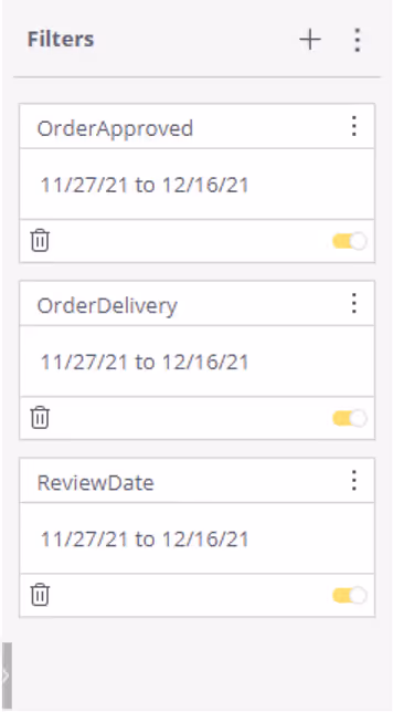
3. Create the pivot and add dimensions. Add the formula and insert filtered measure tag to connect the measure to the required date field, and add ALL() for the other date fields you don’t want to filter the specific measure:
( [# of unique Order ID],[@OrderApproved],
all([Days in order_estimated_delivery_date]),
all([Days in review_creation_date]) )
4. Create the two other formulas (and as many others as you need) and hit apply
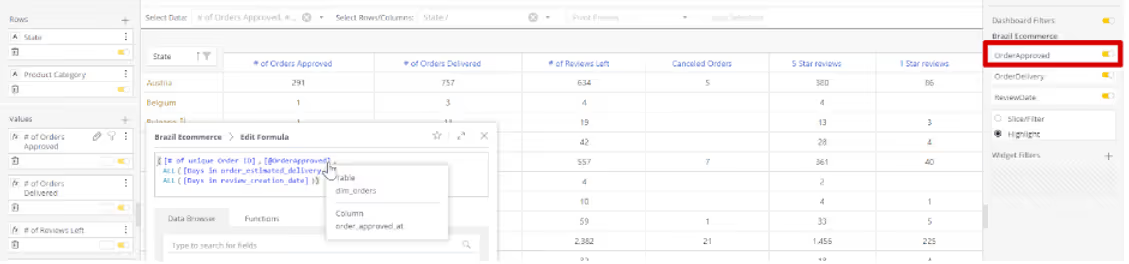
And here is the final Dashboard View:
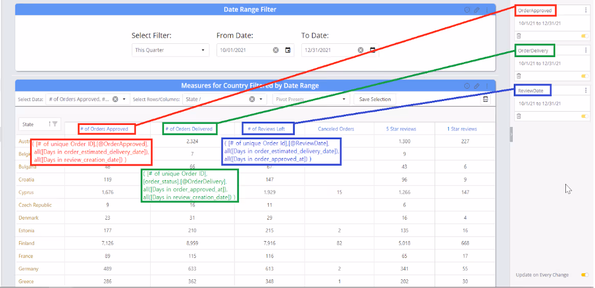
You can also create widgets with measures that only relate to one of the date fields and turn off the other date fields for the whole widget:
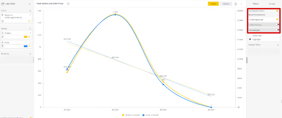
Understanding Sisense Events
Leveraging Sisense Events
Sisense events are notifications that are generated when certain actions occur in Sisense, such as when a dashboard is loaded, a widget is refreshed, or a filter is changed. Events can be used to trigger custom JavaScript code, which can be used to perform a variety of tasks, such as updating other widgets, sending email notifications, or integrating with external systems.
There are three main types of Sisense events:
Widget events:
These events are generated by individual widgets, and they are generally related to the state of the widget, such as when it is refreshed, builds the query, or rendered.
Some common examples of widget events include:
- initialized: Fired after the dashboard is initialized.
- buildquery: Fired when executing the widget's native build query and allows customization of the JAQL query object before execution.
- processresult: Fired when executing the widget's native result processing, and allows customization of the query result before being rendered.
- render: Fired when the widget is rendered.
- ready: Fired when the widget's rendering is over and the widget is ready.
- beforedatapointtooltip: Fired for all widgets that render a tooltip.
Dashboard events
Dashboard events are triggered when certain actions occur on the dashboard level, such as when it is loaded, refreshed, or filter is changed.
Some common examples of dashboard events include:
- initialized: Fired after the dashboard is initialized.
- refreshstart: Fired after one or more widgets have started the refresh process.
- widgetrefreshed: Fired when a widget refresh has ended.
- filterschanged: Fired when the dashboard filter changes.
- widgetprocessresult: Fired after executing the widget’s native result processing, and allows customization of the query result before being rendered.
Global Events
Sisense global events are a special type of event that can be triggered from anywhere in the Sisense web client. They are useful for performing tasks that need to be done regardless of which dashboard or widget is currently active.
Some common examples of global events include:
- apploaded: Fired when the whole Sisense web application is loaded.
- beforemenu: Fired before every menu is opened and allows the removal of existing menu items and the addition of custom menu items.
- beforewidgetmenu: Fired when clicking the widget menu while in Edit Widget mode.
- homeloaded: Fired when the home page in the Sisense Web Application is loaded.
- dashboardloaded: Fired when a dashboard model is loaded into the environment.
How to use Sisense events
To listen for events, you can use the dashboard.on() , widget.on(), prism.on() methods. These methods take the event name as a parameter and a callback function that will be executed when the event is generated.
For example, the following code will listen for the dashboard.initialized event and log a message to the console when the dashboard is loaded:
dashboard.on('initialized', function() {
console.log('Dashboard is loaded');
});
The following code will listen for the widget.render event and log a message to the console when the widget is rendered:
widget.on(render, function() {
console.log(Widget is rendered);
});
The following code snippet shows how to register a custom script to be triggered when a menu it opened:
prism.on(beforemenu, function() {
// Perform some action when a menu is opened.
});
Where to Write Code
To write JavaScript script code at widget level in Sisense, you can use the Edit Script option available in the widget menu. To open the widget edit menu, click on the Edit (pencil) icon in the top-right corner of the widget and click on 3 dots at the top right corner of the widget in edit mode.
To write JavaScript script code at dashboard level in Sisense, you can use the Edit Script option available in the dashboard edit menu. To open the dashboard edit menu, click on the 3 dots in the top-right corner of the dashboard.
The most optimal location for crafting global events is within a plugin. Plugins offer the capability to design solutions that manage global events seamlessly.
Streamlining Workflows with the Widget Script Manager Plugin
One of the challenges designers and administrators often face is managing scripts across multiple widgets, especially when these scripts are used across various widgets of the same type or specific dashboards. This is where the WidgetScriptManager plugin comes into play. It is designed to simplify the process of managing scripts for various widgets and dashboards, this plugin offers a centralized repository for scripts and comes equipped with a wealth of pre-built, handy widget scripts.
Key Features of Widget Script Manager
- Free handy scripts example.
- Easily decide on which widget you would like to deploy the code based on:
- Specific widget
- All widgets from a specific type
- All widgets on specific dashboard
- Any combination of the above
- For example, you can trigger a script to run on a specific set of widgets within a specific dashboard.
- Prevent widgets scripts discrepancies between dashboards.
- Save time of developing and deploying your widgets scripts.
- Enjoy the benefits of a plugin while keeping the flexibility of the widget scripts.
- Can be easily integrated within your Git repository.
Ready to streamline your script management and unlock the potential of handy widget scripts? Check out Paldi's Widget Script Manager for more information
Automated Scheduled Reporting in Sisense
Originaly published in the Sisense community
Automated Scheduled Reporting in Sisense
Well hello there,
Ever since we started using Sisense, we received questions from our end-users (customers as an OEM) for a more featured way of scheduling reports. Out of the box, Sisense's scheduled reporting is done on a dashboard level and does not allow for a lot of customization.
- A dashboard needs to be shared with the user
- The only option is an email report and/or a PDF
- No central overview of all scheduled reports
- No filter settings per report
- No triggering of a report based on a KPI alert
Code all the way
In the beginning, when we were still using Sisense for Windows, we started writing Python scripts to do all these things for us. It could generate not only PDFs but also Excel, CSV, and Word documents with the extension to set filters per job. Per job, we could also set the recipients, which did not necessarily have to be Sisense-users.
A nice addition was that we could also iterate over filter values and merge PDFs for a multi-view report.
We would schedule these jobs with the Windows Task Scheduler and we were on our way. The biggest downside was that coding each job took a lot of time. Furthermore, the code was prone to error and not doable for our end-users at all which made it time-consuming for us to maintain.
If you are interested in the Python scripts, let me know. I can share those with you
N8N; transitioning from code to low-code
To combat these issues, we started looking into expanding our N8N deployment. N8N is an open-source (self-hosted/cloud-hosted) alternative to Zapier. It has an easy-to-use GUI to set up workflows.
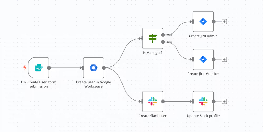
We would build generic workflows to generate PDFs, Excel, and CSVs via Sisense-APIs. These workflows would be triggered by a cronjob that would run every 5 minutes. End-users could create their preferred reports via a Blox form. This would be saved in our database. The workflows would read out that database for a specific time and reports set for that time would be processed.
It was also a nice addition that users could see and maintain the reports themselves all from a Sisense dashboard.
It reduced the load on my team in setting up and maintaining all those scripts. It also decreased the amount of errors due to the excellent logging capabilities of N8N.
Unfortunately, this was not the perfect solution for us. Although it was very cost-effective (the only cost were the time we put in), it did lack some features and user-friendliness.
Sisense Report Manager - from low-code to lower-code
In came the Sisense Report Manager. It took a few versions before it had the capabilities we were looking for (from a security perspective), however since that feature was added we have been using the Sisense Report Manager to our satisfaction. At the moment we have around 1150 reports in the Report Manager that are being sent daily (sometimes even multiple times a day). With a centralized view, it is easy for designers (and us admins) to monitor all reports, send them at will if needed, and see if reports were sent successfully. It is more user-friendly, has a nice overview, and is more stable than our python/n8n variants.
Some aspects can be improved, such as selecting custom filters without the need to code, triggering a report via a Sisense pulse alert, only sending to users with whom you have shared the dashboard, and iterating over filter values.
Paldi Report Manager - from lower-code to no-code
Over the years we have built out an excellent relationship with Paldi Solutions, a Sisense Premium Partner. Do check out their plugins. The ones we use are simply amazing (expandable pivot, advanced filters, widget toolbar, indicator card, new visualizations) and affordable.
When they released their Reprt Manager we jumped on board to check it out and it did not disappoint. It is like the Sisense Report Manager but on steroids. Not only does it offer the same capabilities it improved on it.
Setting custom filters
Setting custom filters is way more user-friendly. It is not with code, but with the same dropdown/functionalities users have on a dashboard level. Simply set your filters via a list, calendar, or timespan.
Iterating over filter values
Even more amazing is the ability to iterate over filter values. Let's say you want a report from 3 departments. Within the old ways that we were doing this, this would have resulted in 3 separate jobs/reports. With the Paldi Report Manager, you can set it to iterate over a filter (or some of its values). It will create a report per value and merge those PDFs.

Excellent additions are...
Furthermore, it is possible to dynamically set the file name. Within the Sisense Report Manager, it would get the dashboard-name plus the date. Within the Paldi Report Manager, you can give it any name you want. Even (!) measure and/or dimension values. For example you filter on department A, you can then set this name dynamically as a filename. Amazing.
These dynamic placeholders can also be set in the email body. You can customize the text (not possible within the Sisense Report Manager) and add placeholders such as; current date, refresh time of the datasource, and values from the dashboard such as measurements and dimensions.
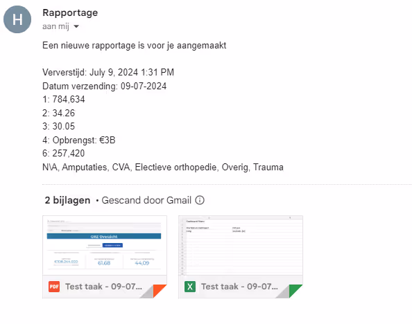
As you maybe have noticed, the application is fully translatable

Last but not least, each job gets a webhook which you can easily trigger from a Sisense Pulse Alert or even from your application. This makes the integration of these kinds of reports even better.

Conclusion
There is a Dutch saying: "op elk potje past een dekseltje" (there is a lid for every jar) which would loosely translate to there is something out there for everyone. For us, this is the Paldi Report Manager. It fits all our needs and support is amazing (kudos to @Evgeni-Rovinsky ). Our feedback and feature requests are picked up and implemented within a few days.
If you have any questions let me know. Regarding N8N we have built some amazing extensions on Sisense. For example, we created an ability for designers to create/edit/delete users and groups (for their organization) or send data which we store in a database that is imported by Sisense.
Add Clickable elements To Dashboard Headers
How to add a button to the dashboard toolbar:
Follow the steps below to incorporate a button into the toolbar of a Sisense dashboard.
- Open the dashboard to which you want to add a button to the toolbar.
- Access the dashboard menu by clicking on the three dots located at the top-right corner of the dashboard and choose 'Edit Script.' This action will open the script editor for the dashboard in a new tab.
- Copy and paste the script provided below into the script editor window of the dashboard. Feel free to customize the button's style, text, and add the desired action to be performed upon clicking.
dashboard.on('initialized', (sender, args) => {
const btnsHolder = $('.prism-toolbar__section--right .prism-toolbar__cell.btns-holder');
const newButton = document.createElement('button');
newButton.className = 'btn custom-btn';
newButton.style.backgroundColor = '#9b9ae6'; //background color
newButton.style.color = '#000000'; //font color
const buttonText = document.createElement('span');
buttonText.className = 'btn__text btn-text-sp2';
buttonText.textContent = 'New Button'; //Text to be displayed on button
newButton.append(buttonText);
$(newButton).on({
click: ({target}) => {
//Add action to be performed on button click
console.log('Button Clicked');
},
mouseenter: (event) => {
$(event.currentTarget).css('background-color', '#aeaddb'); //Background color on hover over
},
mouseleave: (event) => {
$(event.currentTarget).css('background-color', '#9b9ae6'); //Background color
}
});
btnsHolder.prepend(newButton);
})
- Save the script, and refresh the dashboard to observe the newly added button in action.

Enhancing Functionality and End-User Satisfaction in Healthcare Analytics with Paldi Solutions

GeriMedica is a well-established company catering to the Dutch healthcare sector. For over 16 years they’ve specialized in serving elderly care homes. Their services encompass data management for these care homes and maintaining an ERP-like digital medical file system. With a substantial market presence, GeriMedica currently boasts around 130 clients, constituting a commendable 50% market share, and employs a workforce of 90 dedicated professionals.
Challenges
- About 90% of end-users (medical and support staff) lacked data expertise.
- After testing various BI tools, Sisense was chosen for its user-friendly interface.
- However, challenges were encountered with widget scripts and Blox in Sisense.
- Technical requirements alienated non-BI expert medical staff.
- Challenges arose in designing dashboards for quick data consumption by all users.
Until 2018, GeriMedica primarily focused on exporting medical data for their clients. However, as healthcare professionals increasingly required broader access to data, a new dimension of challenges emerged. While customers utilized data for business intelligence (revenue analysis, cost assessment, and productivity evaluation), end-users - the medical staff - were largely excluded from the data utilization loop. GeriMedica estimated that about 90% of their end-users were not data-savvy, they were medical and support staff, who still needed access to data but lacked the necessary expertise.
“We set out to build a data-business unit that served our customers in the best way possible, with a focus on our end-users which are the medical practitioners”, says Hamza, Head of Data Analytics at GeriMedica. In short, GeriMedica had to build technical dashboards aimed at end-users without technical expertise. And Sisense was chosen as the best platform to build these dashboards on.
However, GeriMedica soon encountered new challenges within Sisense as their requirements evolved. Making the use of widget scripts (which are in javascript) and Blox is necessary but difficult to implement. Hamza: “Sooner or later we always had to make complicated use of Sisense’s SDK that they use to create widgets and quickly had to move to use widget scripts, which is in javascript, or we needed to be working with BLOX, which was also not the best way of doing things.”
These technical requirements further alienated the end users - the medical staff - who are not BI experts. This presented a challenge in terms of designing dashboards and ensuring seamless (and quick) data consumption and analytics by both business customers and medical staff.
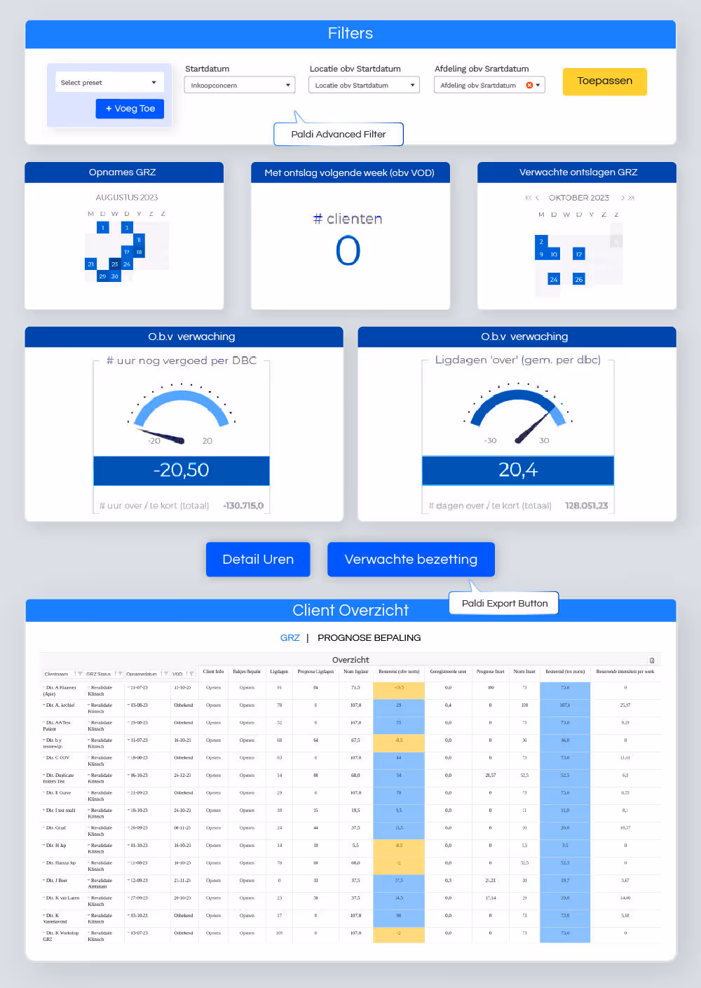
Solutions
- Facing these challenges GeriMedica turned to Paldi Solutions for help.
- Paldi's plugins helped improve user experience and accessibility.
- By simplified data filtering, formatting, and visualization.
- Increased stability, speed, and satisfaction with Sisense.
- No technical training is needed for end-users.
- GeriMedica currently uses a multitude of Paldi plugins including:
Facing these challenges GeriMedica reached out to (the fully HIPAA compliant) Paldi Solutions.
“With the help of Paldi Solutions, we were able to leverage Sisense to create a better user experience from a designer and user perspective.” " said Hamza. Helping to realize the growing demand for better user experience and accessibility, Paldi Solutions provided a suite of self-service plugins that addressed these critical needs. With these plugins, GeriMedica was able to craft a superior UX/UI for both dashboard designers and end-users.
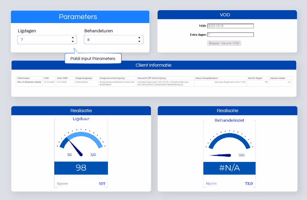
One example provided by GeriMedica is how the ability to add filters on a dashboard level - with drop downs - made it much easier for users to both view the data they needed and save it as a favorite filter (bookmark) to review different important data sets with 1 click. This “Filter Bookmark” plugin massively reduced the amount of time medical staff required before viewing potentially life-saving information.
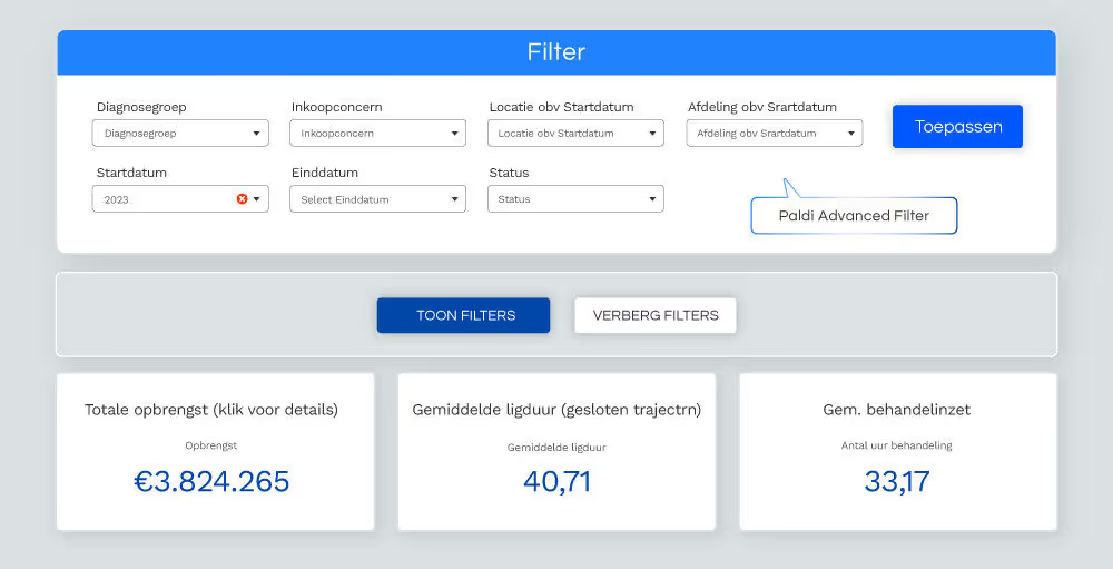
GeriMedica also talked about Paldi’s Expendable Pivot Plugins (Part of Paldi Solution’s new Self-Service powerup), saying that: “One of our most frequently used chart-type is the Expendable Pivot, with its ability to create a really big pivot table quickly, while retaining the power to present a more focused overview by collapsing and expanding sections. As well as its ability to present custom format values, for example from integers to a time format. This is all done with just a click of a button instead of using widget scripts with all kinds of difficulties. With the help of Paldi Plugins, you can just click and it’s there.”
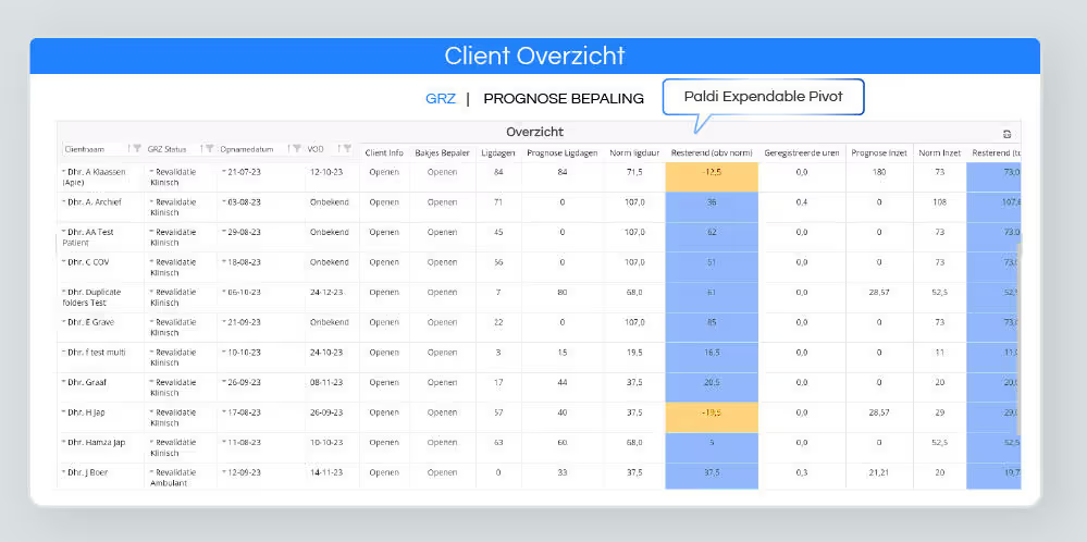
The Paldi plugins solved several endemic problems for GeriMedica by: - Enhancing stability between different Sisense versions. - Improving UX/UI and data clarity.- Optimizing processing speeds.This enabled GeriMedica to leverage the strengths of Sisense while overcoming its challenges. The collaboration with Paldi Solutions allowed for a more intuitive and interactive data visualization, catering to both the medical workers and the business analysts within the elderly care homes.
The benefits derived from Paldi Solutions' integration were gigantic. GeriMedica's end-users, who mainly consist of medical professionals with limited technical proficiency, are now able to immediately access all necessary data without any additional technical training. Paldi’s plugins also facilitated the creation of 60+ predefined dashboards that tell an effective story through data, enhancing interactivity and ease of understanding.
As measured through bi-annual customer surveys, GeriMedica witnessed a substantial spike in customer satisfaction across their application after implementing Paldi's solutions. Users mentioned Paldi’s free “Tutorial Button” plugin specifically as something that helped improve their experience and ability to interact with their data.
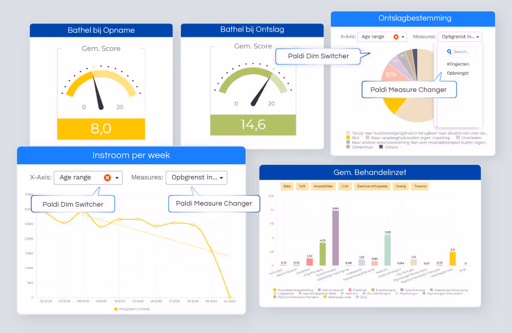
Onboarding and Implementation
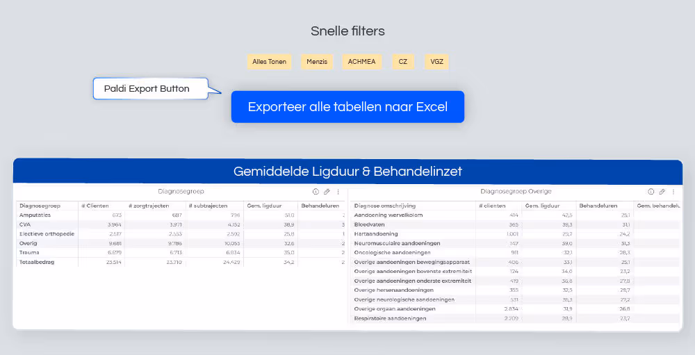
“Sisense out-of-the-box doesn’t have everything, but it gives the capabilities to use Scripts or community plugins. The downside of using Scripts - and especially community plugins - is maintainability. Sisense version upgrades can break scripts and community plugins, or a certain functionality or feature stops working or gives errors”
That’s where GeriMedica's adoption of Paldi Solutions came in, removing the downsides of not being maintained. Paldi’s plugins were safer in use than community plugins or Scripts, due to their simplified installation and single-click update capabilities. Unlike the extensive manual update process prevalent with other plugin makers. Paldi Solutions also guarantees industry-leading support and maintenance and ensures that clients are always up-to-date with the latest features and improvements on both Windows and Linux.
Future Outlook
Looking ahead, the future outlook is promising. GeriMedica is committed to further enhancing its BI dashboards through continued collaboration with Paldi Solutions. The success of the “Self Service” plugin suite and the “Tutorial Button” is indicative of the potential for more tailored solutions catering to specific pain points within the BI landscape. As both companies continue to evolve, Gerimedica is poised to expand its reach and impact within the healthcare sector, while Paldi Solutions is dedicated to continued innovation in BI plugins and solutions that transform data into actionable insights.
Conclusion
The partnership between GeriMedica and Paldi Solutions exemplifies the power of innovative collaboration in overcoming BI challenges and elevating user experiences. By addressing the unique needs of non-technical end-users within the Dutch healthcare sector, Paldi Solutions enabled GeriMedica to bridge the gap between data-savvy analysts and healthcare professionals.
How to Install Sisense Plugins
How to Install Sisense Plugins?
Install with Paldi Space:
Install manually:
Linux Installation
1. Download and Extract:
- Extract the plugin `.zip` file to `/opt/sisense/storage/plugins/` or use the File Management option under System Management in the Admin tab.
2. Install Plugin:
- Go to Admin > Add-ons and wait for the plugin build to complete. When prompted, refresh the page and verify that the plugin is listed in the Add-ons section.
3. Restarting a Plugin (if needed):
- If there are issues, disable the plugin in Admin > Add-ons, wait for the build to finish, and then re-enable the plugin. Refresh the dashboard to check for any remaining issues.
4. Advanced Setup (Pre L2022.10):
- Increase Plugin Build Memory and Time by adjusting CPU and memory settings in the plugins pod with `kubectl`.
- Set `plugins.maxBuildTime` to 300000 (5 minutes) in the Plugins-Service configuration under System Management.
Note: Make sure the Paldi Components plugin is installed, as it is essential for all Paldi plugins.
Windows Installation
1. Increase Plugin Build Memory Time:
- Edit the file `C:\Program Files\Sisense\app\plugins-service\src\features\plugins\plugins.config.js` (open as Admin) and change `maxBuildTime` from 60000 to 300000.
- Save the file and restart the `Sisense.Plugins` service via Task Manager.
2. Install Plugin:
- Extract the plugin `.zip` file to `C:/program files/sisense/app/plugins`.
- Navigate to Admin > Add-ons, wait for the plugin build to complete, refresh when prompted, and verify that the plugin is listed in the Add-ons section.
3. Restarting a Plugin (if needed):
- Disable the plugin in Admin > Add-ons, wait for the build to finish, and then re-enable the plugin.
- If the plugin is still not functioning, restart the `Sisense.Plugins` service via Task Manager and refresh the Add-ons page to complete the process.
Note: Make sure the Paldi Components plugin is installed, as it is essential for all Paldi plugins.
For further assistance, please contact support@paldi.solutions.
Useful links
- Paldi Solutions official Installation instructions
- Sisense documentation on How to install Sisense Add-ons
- Sisense documentation on Working with Sisense Add-ons
Enhancing Web Security: A Deep Dive into Single Sign-On (SSO) and Web Access Tokens (WAT)
Single Sign-On (SSO) and Web Access Tokens (WAT) are two pivotal technologies in the domain of web security and user authentication. SSO simplifies the user experience by enabling access to multiple applications with a single set of login credentials, thereby enhancing both convenience and security. Conversely, WAT plays a crucial role in secure access management by granting temporary tokens that verify user identity and permissions across web applications. Both SSO and WAT are integral to creating a secure and seamless digital environment, each addressing unique facets of user authentication and access control. In the following sections, we will explore the mechanisms, benefits, and implementations of SSO and WAT.
Understanding Single Sign-On (SSO)
Single Sign-On (SSO) is a centralized authentication process that allows users to log in once and gain access to multiple applications without being prompted to log in again for each one. This technology is particularly beneficial in environments where users need to switch between different systems frequently. By reducing the number of login prompts, SSO not only enhances user convenience but also minimizes the risk of password fatigue and the associated security risks, such as password reuse or weak passwords. Moreover, SSO streamlines the management of user credentials, making it easier for administrators to enforce security policies and track access patterns.
How SSO Works
Single Sign-On (SSO) operates by establishing a trusted relationship between an identity provider (IdP) and multiple service providers (SPs). The IdP is responsible for authenticating the user's credentials, while the SPs are the various applications or services the user needs to access. This trusted relationship allows the user to authenticate once and gain access to multiple applications seamlessly.
Step-by-Step Process:
- Initial Authentication:
- When a user attempts to access an application (SP), they are redirected to the identity provider (IdP) if they are not already authenticated. The IdP presents a login page where the user enters their credentials (e.g., username and password).
- Credential Verification:
- The IdP verifies the user's credentials. If the credentials are correct, the IdP generates an authentication token or ticket. This token contains information about the user and is securely signed to prevent tampering.
- Token Exchange:
- The authentication token is sent back to the user's browser, which then forwards it to the original application (SP) the user tried to access. The application verifies the token's validity by checking the IdP's signature.
- Access Granted:
- Once the token is verified, the user is granted access to the application without needing to enter their credentials again. The token can be used for subsequent requests to other SPs, enabling seamless access to multiple applications.
- Single Logout:
- SSO systems often include a single logout feature, where logging out from the IdP also logs the user out from all connected applications. This ensures that the user's session is securely terminated across all services.
Underlying Technologies:
SSO relies on several protocols and technologies to function effectively. Some common protocols include:
- SAML (Security Assertion Markup Language): A widely used standard for exchanging authentication and authorization data between an IdP and SPs. SAML uses XML-based messages to communicate assertions about user authentication and access rights.
- OAuth: An open standard for token-based authentication and authorization, commonly used for granting third-party applications limited access to user resources without exposing passwords.
- OpenID Connect: An authentication layer built on top of OAuth 2.0, allowing clients to verify the identity of users based on the authentication performed by an IdP and to obtain basic profile information.
These protocols ensure secure and efficient communication between the IdP and SPs, enabling the seamless and secure exchange of authentication tokens.
Security Measures:
SSO systems implement several security measures to protect user credentials and authentication tokens:
- Encryption: Authentication tokens are encrypted to protect sensitive information during transmission.
- Digital Signatures: Tokens are digitally signed to prevent tampering and ensure their integrity.
- Multi-Factor Authentication (MFA): SSO can integrate MFA to add an extra layer of security, requiring users to provide additional verification (e.g., a code sent to their phone) beyond just a password.
- Session Management: SSO systems manage user sessions effectively, ensuring that tokens are valid only for a specific period and are renewed or revoked as needed.
By combining these security measures and protocols, SSO systems provide a robust framework for managing user authentication across multiple applications, enhancing both security and user convenience.
Pros and Cons of SSO
Usefule Materials:
Exploring Web Access Tokens (WAT)
Web Access Tokens (WAT) are digital credentials used to authenticate and authorize users across web applications. Unlike traditional session management mechanisms, WATs provide a more scalable and secure method of handling user sessions. Typically, these tokens are used in stateless authentication systems, where the server does not maintain any session information. Instead, all necessary user information is encoded within the token itself, which the client includes in each request to access protected resources.
How Web Access Tokens (WAT) Work
Web Access Tokens (WAT), commonly implemented as JSON Web Tokens (JWT), are digital credentials used to authenticate and authorize users across web applications. Unlike traditional session-based authentication, WATs provide a stateless mechanism, meaning the server does not need to maintain session information. Instead, all necessary user information is encoded within the token itself, which the client includes in each request to access protected resources.
Step-by-Step Process:
- User Authentication:
- When a user logs in to an application, they provide their credentials (e.g., username and password). The application sends these credentials to an authentication server for verification.
- Token Generation:
- Upon successful authentication, the authentication server generates a token, typically a JWT. This token contains encoded information about the user, such as their user ID, roles, and permissions. The token is digitally signed using a secret key or public/private key pair to ensure its integrity and authenticity.
- Token Storage:
- The generated token is sent back to the client (e.g., the user's browser or mobile app), where it is stored securely, often in local storage or a secure cookie. It's crucial to handle the token securely to prevent unauthorized access, such as through cross-site scripting (XSS) attacks.
- Token Usage:
- For subsequent requests to access protected resources, the client includes the token in the request header, typically in the Authorization header as a Bearer token. For example, the header might look like this: Authorization: Bearer <token>.
- Token Verification:
- When the server receives a request with a token, it verifies the token's signature to ensure it hasn't been tampered with. The server also checks the token's validity, including its expiration time and any other claims it contains. If the token is valid, the server processes the request and grants access to the requested resource.
- Token Expiration and Renewal:
- Tokens are usually issued with an expiration time to limit their validity period. Once a token expires, the user must re-authenticate to obtain a new token. Some systems use refresh tokens, which are long-lived tokens that can be used to obtain new access tokens without requiring the user to log in again.
Security Measures:
To ensure the security of WATs, several best practices are implemented:
- Encryption: Sensitive information within the token can be encrypted to protect user data.
- Signature Verification: Tokens are signed to ensure their integrity and authenticity. The server uses the same secret key (or public key in asymmetric encryption) to verify the token's signature.
- Secure Storage: Tokens should be stored securely on the client side, avoiding exposure to client-side scripts to prevent XSS attacks.
- Token Expiration: Tokens have an expiration time to limit the window of opportunity for misuse. Short-lived access tokens and long-lived refresh tokens balance security and user convenience.
- Scope and Audience Restrictions: Tokens can include claims that restrict their usage to specific scopes and audiences, enhancing security by ensuring tokens are used only as intended.
By following these practices, WATs provide a scalable and secure method of managing user authentication and authorization across web applications, improving both performance and user experience.
Pros and Cons of WAT
Usefule Materials:
Integrating SSO and WAT
Combining SSO and WAT can provide a comprehensive authentication and authorization solution. SSO can handle the initial authentication process, while WATs can manage user sessions and permissions across different applications. This integration allows organizations to leverage the strengths of both technologies, providing a seamless and secure user experience. In the next sections, we will explore real-world examples, best practices, and implementation strategies for integrating SSO and WAT in web applications.
- To further simplify the way you manage and implement Sisense, explore our Sisense Admin Plugins that streamline admin workflows and enhance customization.
- To get a better understanding of how Sisense operates behind the hood, take a look at our Understanding Sisense Events post.